Rotated axis labels in R plots
Junk Charts 2014-08-05
(This article was first published on me nugget, and kindly contributed to R-bloggers)
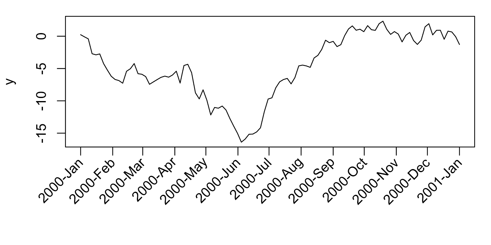
It's somehow amazing to me that the option for slanted or rotated axes labels is not an option within the basic plot() or axis() functions in R. The advantage is mainly in saving plot area space when long labels are needed (rather than as a means of preventing excessive head tilting). The topic is briefly covered in this FAQ, and the solution is a bit tricky, especially for a new R user. Below is an example of this procedure.
To reproduce example: # Example data tmin <- as.Date("2000-01-01") tmax <- as.Date("2001-01-01") tlab <- seq(tmin, tmax, by="month") lab <- format(tlab,format="%Y-%b") set.seed(111) x <- seq(tmin, tmax, , 100) y <- cumsum(rnorm(100)) # Plot png("plot_w_rotated_axis_labels.png", height=3, width=6, units="in", res=400) op <- par(mar=c(6,4,1,1)) plot(x, y, t="l", xaxt="n", xlab="") axis(1, at=tlab, labels=FALSE) text(x=tlab, y=par()$usr[3]-0.1*(par()$usr[4]-par()$usr[3]), labels=lab, srt=45, adj=1, xpd=TRUE) par(op) dev.off()
To leave a comment for the author, please follow the link and comment on his blog: me nugget.
R-bloggers.com offers daily e-mail updates about R news and tutorials on topics such as: visualization (ggplot2, Boxplots, maps, animation), programming (RStudio, Sweave, LaTeX, SQL, Eclipse, git, hadoop, Web Scraping) statistics (regression, PCA, time series, trading) and more...