Adventures in creative graphing
Fafblog 2020-04-13
Every year, I have to teach students about how to properly chart data. I’ll have to use this as an example of how to do it badly.
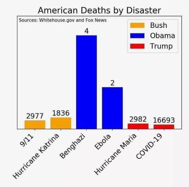
(I know, this isn’t literally put out by the White House, it’s mocking the Republican downplaying of COVID-19 deaths.)