How do I make my graphs?
Statistical Modeling, Causal Inference, and Social Science 2013-03-15


Someone who wishes to remain anonymous writes:
I’ve been following your blog a long time and enjoy your posts on visualization/statistical graphics matters. I don’t recall however you ever describing the details of your setup for plotting. I’m a new R user (convert from matplotlib) and would love to know your thoughts on the ideal setup: do you use mainly the R base? Do you use lattice? What do you think of ggplot2? etc.
I found ggplot2 nearly indecipherable until a recent eureka moment, and I think its default theme is a waste tremendous ink (all those silly grey backgrounds and grids are really unnecessary), but if you customize that away it can be made to look like ordinary, pretty statistical graphs.
Feel free to respond on your blog, but if you do, please remove my name from the post (my colleagues already make fun of me for thinking about visualization too much.)
I love that last bit!
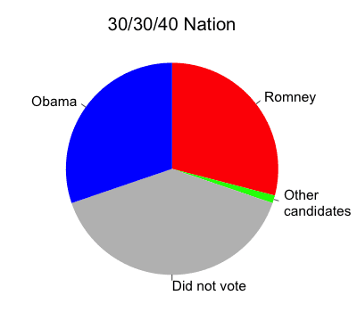
Anyway, my response is that I do everything in base graphics (using my own defaults), and usually I make a graph by using some previous graph as a template. That works for most of my graphs. Here’s an example, and here’s another.
But the beautiful grids of maps (see here, for example), those I did by asking Yu-Sung, Daniel, Yair, etc., to make them, and then going back and forth making them better. That reminds me: I have to finish a paper I’m writing with Yair about the details of what makes these graphs work. We’ve talked about having these maps made by default in the “mrp” package but I don’t think we’re quite there yet.
If I could start over, maybe I’d use lattice or ggplot2. I use what I’m comfortable with, but it’s not always so great. I don’t know that I can make any general recommendations, except that once you have a graph you like, you can use it as a starting point for your next plot. My own graphs have gradually improved over the decades (as I discuss in this presentation). I think someone starting out now should be able to do much better.


P.S. I’ve purposely included some not-so-fancy graphs here (and some made by others working with me) to emphasize that statistical graphics is an everyday job, it’s not just about creating showcase pieces.