Best chart I have seen this year
Junk Charts 2022-01-20
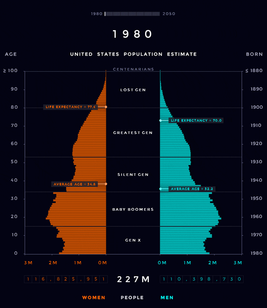
Marvelling at this chart:
***
The credit ultimately goes to a Reddit user (account deleted). I first saw it in this nice piece of data journalism by my friends at System 2 (link). They linked to Visual Capitalism (link).
There are so many things on this one chart that makes me smile.
The animation. The message of the story is aging population. Average age is moving up. This uptrend is clear from the chart, as the bulge of the population pyramid is migrating up.
The trend happens to be slow, and that gives the movement a mesmerizing, soothing effect.
Other items on the chart are synced to the time evolution. The year label on the top but also the year labels on the right side of the chart, plus the counts of total population at the bottom.
OMG, it even gives me average age, and life expectancy, and how those statistics are moving up as well.
Even better, the designer adds useful context to the data: look at the names of the generations paired with the birth years.
This chart is also an example of dual axes that work. Age, birth year and current year are connected to each other, and given two of the three, the third is fixed. So even though there are two vertical axes, there is only one scale.
The only thing I'm not entirely convinced about is placing the scroll bar on the very top. It's a redundant piece that belongs to a less prominent part of the chart.