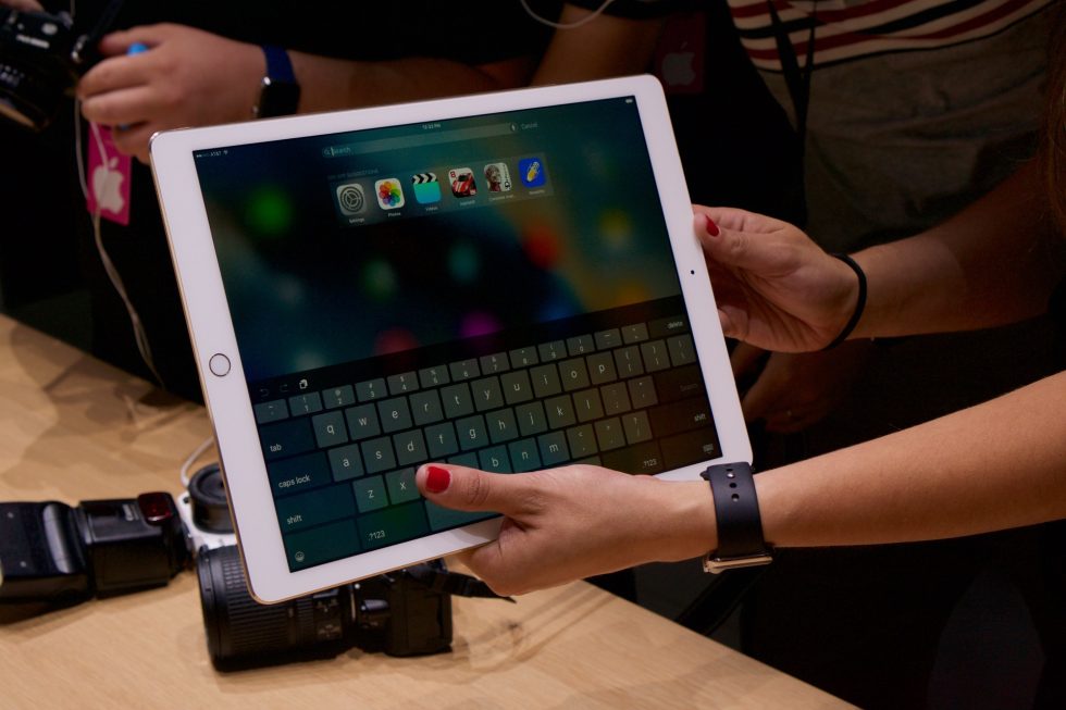
Hands-on with the iPad Pro, its keyboard, and its pencil
Ars Technica 2015-09-09
Apple's iPad Pro is pretty much what you'd expect: an iPad Air grabbed by the corners and stretched.
The new tablet uses the same basic design cues as the iPad Mini and iPad Air before it—chamfered metal edge, thin but not exceptionally narrow bezels, volume buttons with no mute switch, Home button with TouchID. Everything is just expanded.
The 12.9-inch 2732×2048 display is the tablet's raison d'etre, and iOS does a few things to adapt to such a large screen (the Pros we saw were running a beta build of iOS 9.1, which will presumably be released when the iPad Pro comes out in November if not a bit before). The software keyboard expands and assumes a layout reminiscent of the standard Mac keyboard, and iOS 9's Split View feature has more room to work than it does on the iPad Air 2—it should be able to display two full-sized iPad apps next to each other without having to switch to "compact" views, if that's what the user wants. A bigger screen also feels like a natural fit for the picture-in-picture mode, which can make things feel just a bit claustrophobic on the smaller iPads.
