You can learn a lot from a simple simulation (example of experimental design with unequal variances for treatment and control data)
Statistical Modeling, Causal Inference, and Social Science 2025-03-21
We were talking about blocking in experiments in class today, and a student asked, “When should we have an equal number of units in the treatment and control groups?”
I replied that the simplest example is when the treatment is expensive. You could have 10,000 people in your population but only enough budget to apply the treatment to 100 people, so 99% will be in the control group. In other settings, the treatment might be disruptive, and, again, you’d only apply it to a small fraction of the available units.
But even if cost isn’t a concern, and you just want to maximize statistical efficiency, it could make sense to assign different numbers of units to the two groups.
For example, I started to say, suppose that your outcomes are much more variable under the treatment than the control. Then to minimize the basic estimate of the treatment effect—the average outcome in the treatment group, minus the average among the controls—you’ll want more treatment observations, to account for the higher variance.
But then I paused. I was struck by confusion.
There are two intuitions here, and they go in opposite directions:
(1) Treatment observations are more variable than controls. So you need more treatment measurements, so as to get a precise enough estimate for the treatment group.
(2) Treatment observations are more variable than controls. So treatment observations are crappier, and you should devote more of your budget to the high-quality control measurements.
I had a feeling that the correct reasoning was (1), not (2), but I wasn’t sure.
So how did I solve the problem?
Brute force.
Here’s the R:
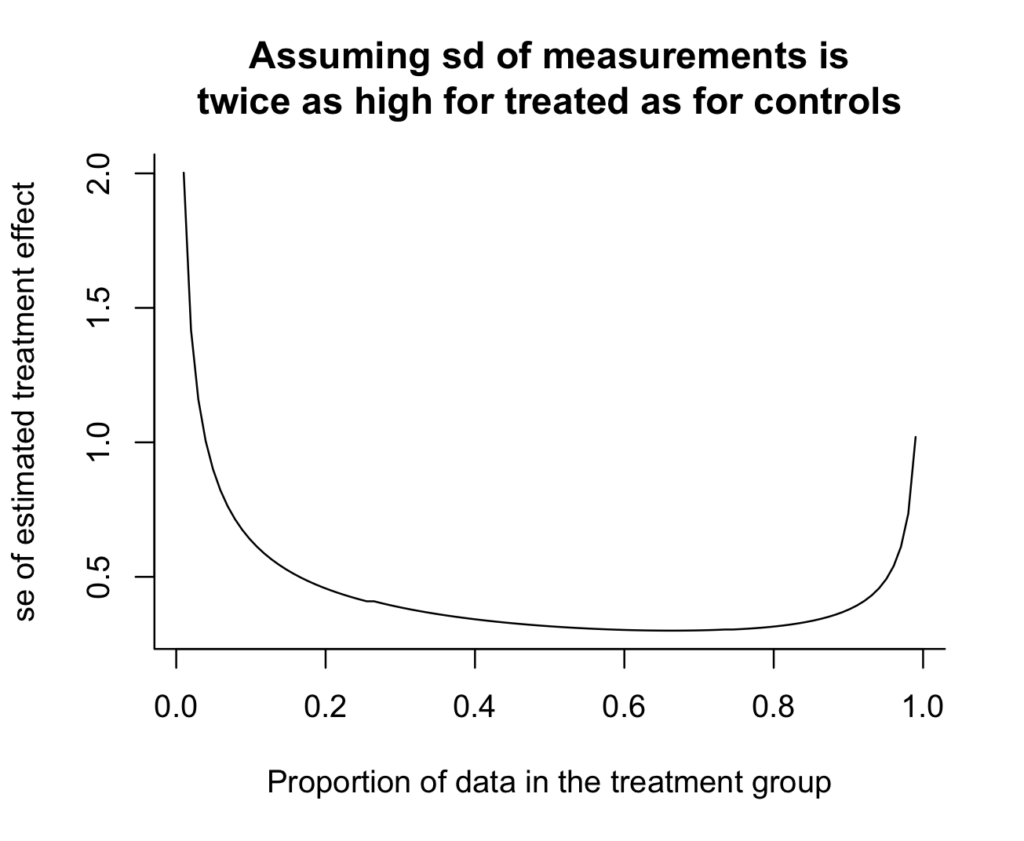
n <- 100expt_sim <- function(n, p=0.5, s_c=1, s_t=2){ n_c <- round((1-p)*n) n_t <- round(p*n) se_dif <- sqrt(s_c^2/n_c + s_t^2/n_t) se_dif}curve(expt_sim(100, x), from=.01, to=.99, xlab="Proportion of data in the treatment group", ylab="se of estimated treatment effect", main="Assuming sd of measurements is\ntwice as high for treated as for controls", bty="l")And here's the result:
Oh, shoot, I really don't like how the y-axis doesn't go all the way to zero. It makes the variance reduction look more dramatic than it really is. Zero is in the neighborhood, so let's invite it in:
curve(expt_sim(100, x), from=.01, to=.99, xlab="Proportion of data in the treatment group", ylab="se of estimated treatment effect", main="Assuming sd of measurements is\ntwice as high for treated as for controls", bty="l", xlim=c(0, 1), ylim=c(0, 2), xaxs="i", yaxs="i")

And we can see the answer: if there's twice as much variation in the treatment group as in the control group, then you should take twice as many measurements in the treatment group. The curve is minimized at x=2/3 (which we could check without plotting anything, but the graph provides some intuition and a sanity check). Argument (1) above is correct.
On the other hand, the standard error from the optimal design isn't much lower than the simple 50/50 design, as can be seen by computing the ratio:
print(expt_sim(100, 1/2) / expt_sim(100, 2/3))
which yields 0.95.
Thus, the better design yields a 5% reduction in standard error--that is, a 10% efficiency gain. Not nothing, but not huge.
Anyway, the main point of this post is you can learn a lot from simulation. Of course in this case the problem can be solved analytically---just differentiate (s_c^2/(1-p) + s_t^2/p) with respect to p and set the derivative to zero, and you get s_c^2/(1-p)^2 - s_t^2/p^2 = 0, thus s_c^2/(1-p)^2 = s_t^2/p^2, so p/(1-p) = s_t/s_c. That's all fine, but I like the brute-force solution.