Looking at the Port Huron Statement, 63 years later
Statistical Modeling, Causal Inference, and Social Science 2025-12-28
In preparation for this new class, I was reading the Port Huron Statement, White Collar, the classic 1962 manifesto from the Students for a Democratic Society. It’s good!
Here’s the stirring beginning:

The statement continues:

It’s interesting to think how things have changed. Social inequality is still a big deal and nuclear war is still a threat, but now the most important issues are economic problems, the government, and immigration. OK, those numbers came from a poll of all American adults, but I think if you just surveyed young left-wing activists–today’s equivalent of the Students for a Democratic Society–that the economy would still be the leading issue, maybe with democracy or political polarization as #2.
It’s funny, though–and I’m far from the first to point this out–that Americans are so much less satisfied with the economy now than they were in 1962, given how much richer the society is: a smaller percentage living in poverty and with the median American having better cars, bigger houses, and all the rest. I get it: for one thing, people measure their status against what they already have, and we take for granted so much that we have now; also, the economy isn’t just about ownership and consumption, it’s also about having a stable job and a sense of good things happening in the future. Just for example, global warming is very low on most people’s list of most important issues, but there is widespread concern that future generations will struggle economically, that there is some form of unsustainability, whether from physical (environmental) constraints or from societal problems that won’t be resolved. I kinda want to say that usual economic theory doesn’t handle this so well, but it’s not quite a problem with economics, which can include the value of future wellbeing; the problem lies more at the intersection of economics, politics, and psychology, in that in the short term voters are influenced by short-term economic conditions that seem to have only a very indirect connection to larger concerns.
In any case, let’s return to the pleasant world of 1962, where the economy was in the middle of a decades-long period of growth and young radicals could focus their energy elsewhere.
There’s lots to chew on. For example:

Listed fourteenth, huh? I couldn’t easily find the relevant Gallup report online, but I was able to access this 1985 article, “The Polls: America’s Most Important Problems Part I: National and International,” by Tom Smith, which reports that Gallup started asking that question back in 1935! Here’s the data summary from 1962:
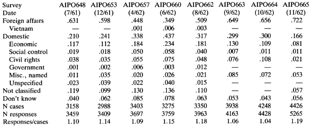
Wait–“foreign affairs” was listed by 72% of respondents! “International affairs” and “foreign affairs” are the same thing, no? So I guess the writers of the Port Huron Statement were engaging in a bit of poetic license on this one.
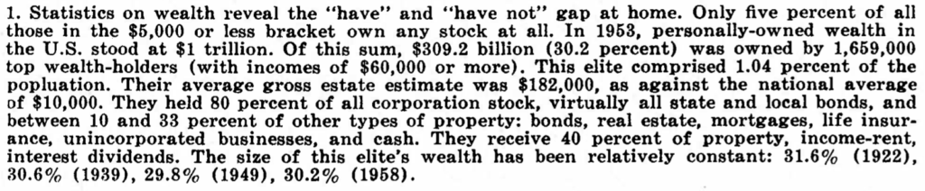
Then there’s this:

With this footnote:
I was curious how this has changed since then. Since 1962, America has become much more unequal economically, at least at the high end; that’s been well documented. On the other hand, it’s much more common to own stock than it used to be. Overall I’d say that “the percentage of stock owned by the top X%” is not a good measure of inequality–really you’d want the percentage of total wealth–; on the other hand, to the extent that government and elite policies are focused on pumping up the stock market–or, at least, stopping it from crashing–then, yeah, it’s a relevant number to look at.
Anyway, I googled *what percent of stock is owned by the richest 1%*, which turned up a 2024 article from an advocacy organization that begins:
New Federal Reserve analysis of stock markets has found that the concentration of ownership of the public equity stock market has hit an all-time high.
The article also points to this news article entitled “The rich now own a record share of stocks,” that pointed to this op-ed that reported:
While the richest 1 per cent owned just 40 per cent two decades ago, their share stood at 54 per cent in the most recent data from 2022.
The Federal Reserve link gives this graph:
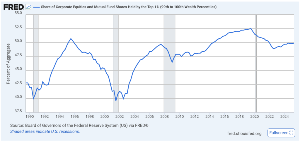
If the Port Huron Statement is correct, the richest 1% back in 1962 owned over 80% of the stock, but now it’s only 52%–so, hardly an “all-time high”! We need a graph that goes back before 1990.
Hey–some googling turns up this paper, “Household Wealth Trends in the United States, 1962 to 2019” . . . sounds like just what we’re looking for! But, no, I don’t see the percentage of stock owned by the richest 1% in 1962.
My guess is that the Port Huron Statement is correct, or nearly correct, in its stock numbers and that the news reports claiming “the concentration of ownership of the public equity stock market has hit an all-time high” are wrong–but it doesn’t really matter because stock ownership was so much less of a thing back in 1962.
At that point you might ask, Why did I just spend a half hour failing to tracking down a number that doesn’t really matter? The answer is, you don’t always know what matters ahead of time. And it’s good to check things when you can.