It’s all about the nonlinearity: An interesting statistical example of flaws in a voter impact index
Statistical Modeling, Causal Inference, and Social Science 2026-07-13
The following came in the email the other day:
I’m reaching out to introduce the Voter Impact Index, a new data tool from PowerMoves that assigns every U.S. zip code a voter impact score based on the recent competitiveness of six federal and state elections tied to that location.
The Index may be useful in your teaching or research in a few concrete ways:
— Classroom discussions on political geography, voter mobilization, and the relationship between where people live and how much their votes matter — Research applications exploring electoral competitiveness, voter sorting, and the civic behavior of movers (we estimate 15 million registered voters relocate annually) — Student projects analyzing zip-code-level electoral data across districts
The underlying data, code, and methodology are fully open and accessible via GitHub through our website at PowerMoves.Vote — making it straightforward to build on or replicate.
PowerMoves is a nonpartisan project. The Index draws from trusted nonpartisan sources and assigns scores regardless of party affiliation.
I was curious so I looked up my own zip code, and here’s what came up:

A “medium” voter impact of 44/100. Are you kidding? Yes, you can get lower impact scores (just try typing in 02139), but something close to the midpoint on a 0-100 scale doesn’t sound right to me. We almost never have close elections. New York is not a swing state, and even our local elections are never close.
OK, the 2022 governor’s election in NY was pretty close, I’ll grant them that, and the 1994 race was even closer, as were 1982 and 1978 . . . but that’s going back pretty far, and they’re only weighting the governor races at 15% (go here and scroll to the bottom), so I was puzzled as to how voters in our district can be judged to an impact of 44 on a 0-100 scale. Even if you count the governor’s election as close (and it wasn’t that close), that would still only you to 18.
If you read through that document carefully, you can figure out what’s going on:
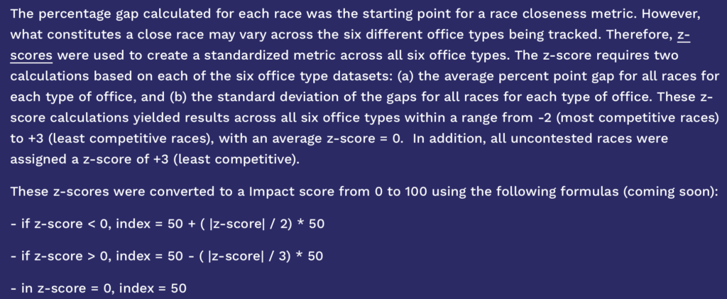
OK, there’s this weird bit about dividing by 2 or 3, but that’s not the key issue. The big problem, I think, is linearity. For example, in the 2024 presidential race, Kamala Harris won the two-party in New York by a 13-point margin. Not close at all! Really not close, considering that, had the state election been close, there’s no way that New York’s electoral votes would’ve been decisive. My voter impact for this election was approximately zero (see some calculations here, albeit from an earlier year). If you want to get technical about it, the probability my vote is decisive is something like 1/100 of the probability that a swing state’s voter will be decisive.
So if the “presidential election” contribution to this index is 100 for Wisconsin, Michigan, and Pennsylvania, and something like 50 in a state like North Carolina or Georgia, then it should be approximately 1 in New York. Or maybe 0.1. Or maybe 2. In any case, some tiny number. Even the governor’s race, which Hochul won by 6 percentage points . . . ok, that’s close, but, again, there are closer races for governor. I went online and looked it up, and there were a couple races decided by less than 1 percentage point of the vote. If those tossups count as a voter impact as 100, then maybe the New York race would be a 50? or maybe something less than that?
So if you add all up all these voter impact score and weight them, you might get something like a 10 for my district, if you’re being generous. Not 44.
It’s an interesting example. At first, doing this linear scaling could seem to make sense. But not if your goal is to measure voter impact.
To put it another way, their measure is underestimating the value of voting in a swing state or a swing district. The linear mapping smooths out the signal.
P.S. I replied to the above email to share my concern with the creators of this index. We had a cordial email exchange but ultimately they didn’t seem convinced by my argument and so they left the index as it is. Too bad. But, hey, they’re doing the work, it’s their call: if they want to categorize my zip code as having “median” voter impact . . . well, it’s a free country!