Kaiser Fung on Axis Zero and Spiral Charts
Statistical Modeling, Causal Inference, and Social Science 2022-01-22
1. Axis Zero
Regarding the perennial question of whether to have your y-axis start at zero, I wrote, “If zero is in the neighborhood, invite it in.” Kaiser improves this advice by pointing out, first, that you should only worry about zero if it makes sense. I’d illustrated that point with the example of degrees Fahrenheit; Kaiser uses the example of a test score where nobody actually scores anything close to zero. Another example would be adult heights: zero height is meaningful in a literal sense but is not at all in the neighborhood of the data. More formally we could make this a statement about dynamic range, using a rule such as, “For all-positive data y, include zero if max(y)/min(y) < 2." But only if "zero" has some meaning. In my experience, it usually does, but not always, and I've seen some pretty silly examples where people miss the point. For example, taking survey responses that are on a 1-5 scale and plotting on a graph that goes down to zero. Don't do that! In that case, better to put the axis at 3.In his post, Kaiser also points out that, if your x-axis isn’t at y=0, you should take a look at where it is, in case you’re losing an opportunity to convey some information. Somehow this doesn’t seem like such a big deal for the x-position of the y-axis, maybe because x often represents time, with a continuous data stream so there’s no natural starting point.
2. Spiral Charts
Kaiser discusses an eye-catching graph of new covid cases that recently appeared in the newspaper and apparently was much discussed on twitter. Here it is:

I agree with Kaiser that a straight-up time series graph coveys the data much better: the time-series clearly displays each peak, as well as subtle details such as the fact that the initial peak was slow to decline, whereas later peaks were more symmetric:
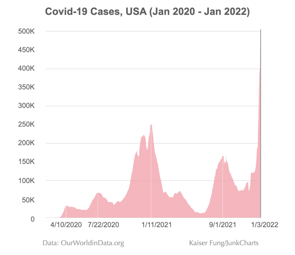
I don’t think Kaiser’s graph is perfect, either: for my taste, he’s got too many numbers on the y-axis, which seems like a relic from the old days when graphs were used as look-up tables, and I find the horizontal axis labeling very confusing: I’d prefer some clarity showing 2020, 2021, and 2022 rather than these selected dates which then I need to decode.
Kaiser does a good job of explaining what got lost when going from the time series to the spiral: in short, the spiral has a lot less resolution—unless you really really stare at it, you can’t learn much more than the fact that the rate of new covid cases started at 0 and then had some cycles of increasing and decreasing, and is now high—which any reader of the newspaper already knew before seeing the graph! The curving and reflecting and stretching makes it just about impossible to see anything more than that (again, compare to the time series), and it also adds this weird artifact by which it looks like the lines in 2022 is about to intersect the line from 2021, but that has no meaning as it’s entirely dependent on arbitrary scaling parameters. Also it’s not clear why the spiral doesn’t start at the center! Lots of puzzling things there.
But . . . what is the purpose of the spiral, exactly? It’s not to convey the data. For that, we have the time series graph! The spiral is there to look cool, to get our attention. That’s not such a bad goal. As Antony Unwin and I wrote, we can think of such infographics not as competing with statistical data visualizations but rather as illustrations:
Newspaper and magazine articles are often illustrated by photographs and cartoons which are pretty or shocking or attention-grabbing or interesting and in some way complement the substance of the article. We don’t generally criticize newspaper illustrations as being noninformative; they’re not really expected to convey substantive information in the first place. From that perspective, an infographic can be a good choice even if it does not clearly display patterns in the data.
We recommend the click-through solution: Start with the eye-catching infoviz, then click on it to get the statistical visualization (in this case, the time series plot), then click again to get the spreadsheet with the raw data.
Ideally you can have a graph that is both statistically informative and surprisingly beautiful, as with these recent examples from Danny Dorling. But usually we get just one or the other. I guess we can appreciate a striking infoviz for what it is, while also following Kaiser’s lead and being aware of what it’s missing.
Also, there is one thing that the spiral graph can give you, in principle, which is that it lines up different parts of the year, so in theory you could see patterns recurring each spring or whatever. In this particular example, though, we don’t see any notable annual-cycle patterns so that doesn’t really give us anything.