Generalized Pairs Plot: It’s about time!
R-bloggers 2013-03-28
JW Emerson, WA Green, B Schloerke, J Crowley, D Cook, H Hofmann, H Wickham (2013) The Generalized Pairs Plot. Journal of Computational and Graphical Statistics 22(1).
Until now, there were no widely available pairs plots that acommodated both numerical and categorical fields. A browse through the R Graph Gallery confirms this (as of 1/30/2013). See here too: a post on the Quick-R blog. I had been working on such a plot when I discovered the above article. Hence, I'm using this post to share my work, which I will probably abandon in favor of the above.
Any number of statistical graphics might be used instead of a scatterplot for numeric/numeric pairs; maybe a hexbin plot. A sieve plot or an association plot might be used as an alternative to the mosaicplot for factor/factor pairs. A beeswarm boxplot plot might be used in place of side-by-side boxplots for numeric/factor pairs.
Here was my provisional version of the generalized pairs plot, which I had called an 'association matrix plot':
pairsdf <- function(df, abbr = TRUE, abbr.len = 4) { par(mfrow = rep(length(df), 2)) for (row in 1:length(df)) { xr <- df[[row]] if (is.character(xr) || is.logical(xr)) xr <- as.factor(xr) if (is.factor(xr) && abbr) levels(xr) <- abbreviate(levels(xr), 4) for (col in 1:length(df)) { xc <- df[[col]] if (is.character(xc) || is.logical(xc)) xc <- as.factor(xc) if (inherits(xc, "factor") && abbr) levels(xc) <- abbreviate(levels(xc), 4) cnm <- names(df)[col] rnm <- names(df)[row] if (col == row) { plot(c(0, 1), c(0, 1), type = "n", xaxt = "n", yaxt = "n", bty = "n", xlab = "", ylab = "", main = "") text(x = 0.5, y = 0.5, labels = cnm, adj = c(0.5, 0.5), cex = 2) } else { iscf <- is.factor(xc) iscn <- is.numeric(xc) isrf <- is.factor(xr) isrn <- is.numeric(xr) if (isrf && iscf) { mosaicplot(table(xc, xr), xlab = cnm, ylab = rnm, main = "", las = 2, color = TRUE, cex = 1.1) } else if (isrn && iscn) { plot(xc, xr, xlab = cnm, ylab = rnm, main = "", las = 2, cex = 1.1) } else if (isrn && iscf) { boxplot(xr ~ xc, xlab = cnm, ylab = rnm, main = "", las = 2, cex = 1.1) } else if (isrf && iscn) { boxplot(xc ~ factor(xr, levels = rev(levels(xr))), xlab = cnm, ylab = rnm, main = "", las = 2, cex = 1.1, horizontal = TRUE) } else stop("urecognized variable type") } } }}Below are several association matrix plots generated by the above function (i.e., pairsdf) for data sets found in the MASS package. When there are many fields, I recommend using three to four square inches per plot.
It's easy to see that the coop data set describes a simple factorial experiment. 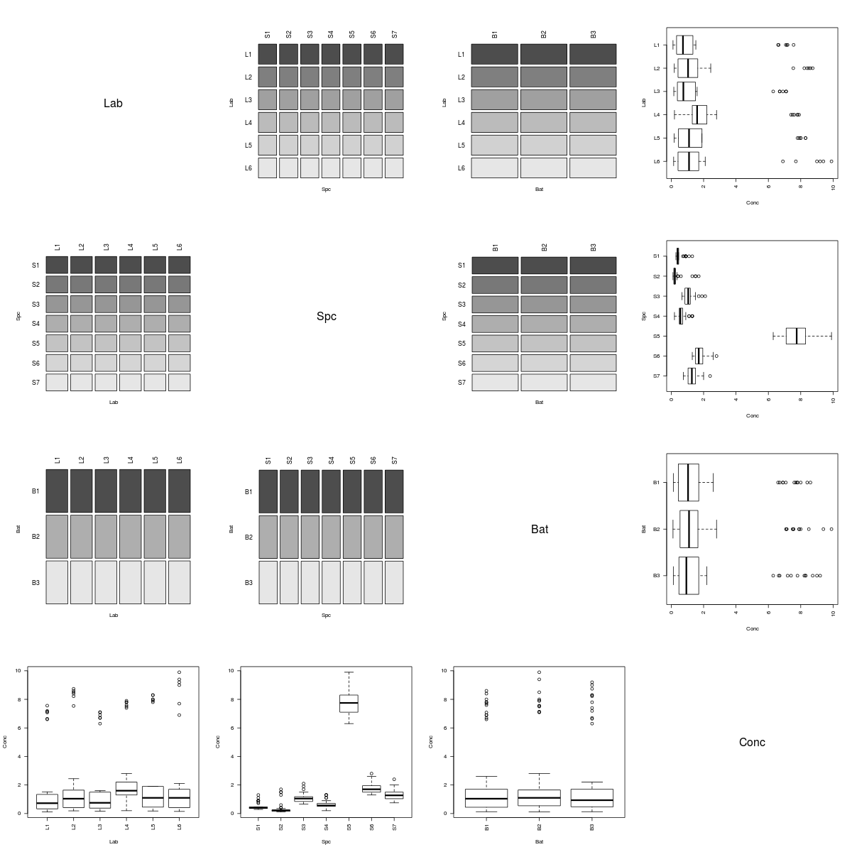 However, the Rabbit data clearly arose from a more complicated experiment.
 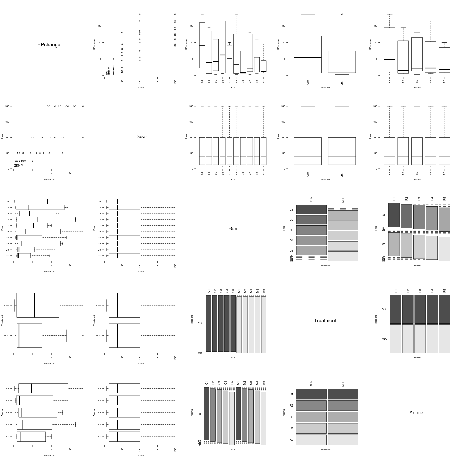 The fields of the farms data set are all of the factor class.
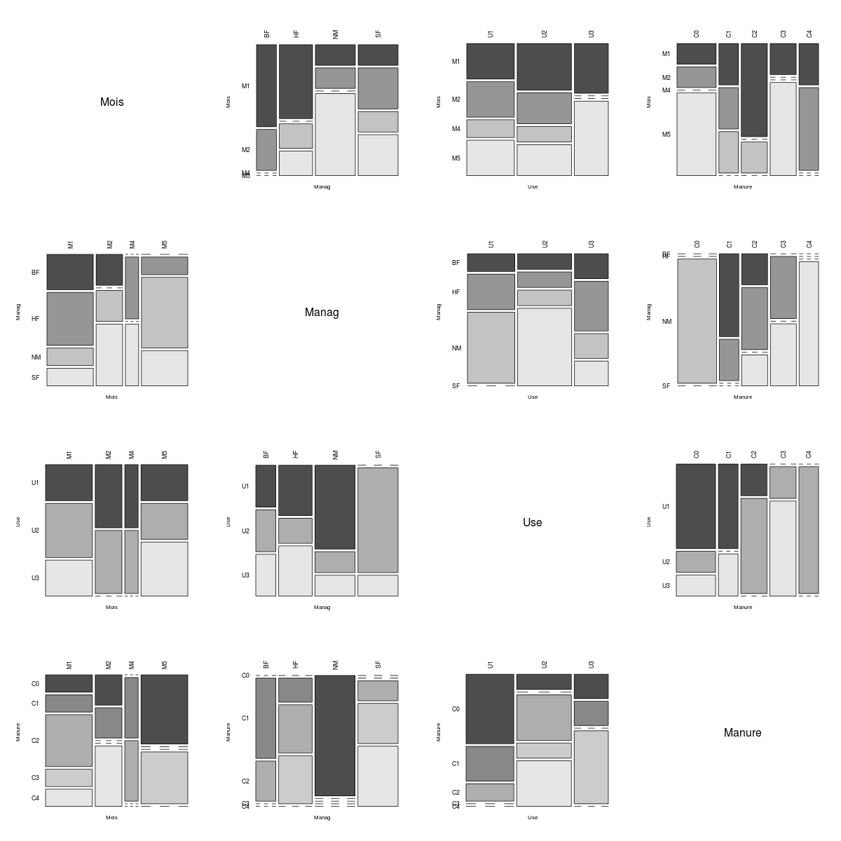
R-bloggers.com offers daily e-mail updates about R news and tutorials on topics such as: visualization (ggplot2, Boxplots, maps, animation), programming (RStudio, Sweave, LaTeX, SQL, Eclipse, git, hadoop, Web Scraping) statistics (regression, PCA, time series,ecdf, trading) and more...