Zero Sum Problems
R-bloggers 2026-05-22
Want to share your content on R-bloggers? click here if you have a blog, or here if you don't.
Over at Daring Fireball, John Gruber makes a passing observation about the Apple Sports app:
I’ve got some gripes about certain specific aspects of Apple Sports. Like, where does one even start to explain how much is wrong with their zero-sum visualization of team stats? Has anyone ever even seen a presentation like that before? Anyone?
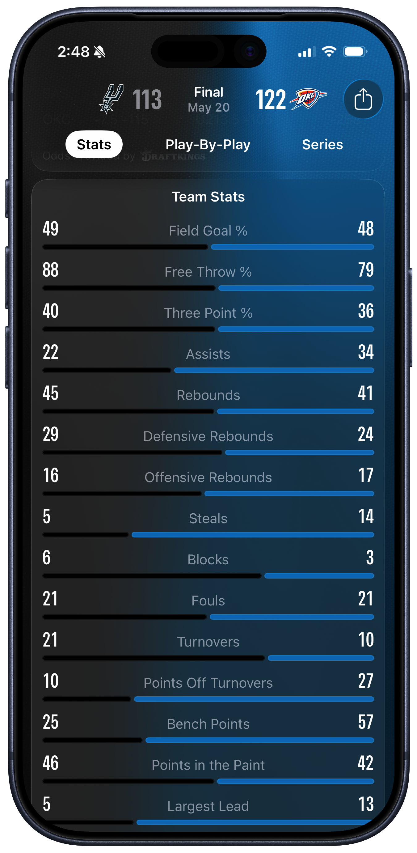
That “Anyone” link lands over here. Hi everyone! The team stats image is quite confusing. It’s a summary of a game between the San Antonio Spurs and the Oklahoma City Thunder. I don’t know much about basketball, but I do know a bit about data visualization and in a pleasing coincidence my former student Josh Fink is the A-VP of Basketball Data Science for the Spurs. Here is the image that John objected to:

I had to look at it for a while as well.
I just finished driving a very long way up the side of the country, so I’m kind of tired. But even allowing for that, boy, this way of representing things really is quite confusing. Not being an Apple Sports user I had to look at it for a bit to understand what was happening. But, now that it has given me a headache, I can kind of see why whoever designed this ended up in the undoubtedly bad place they did.
Before I get to why I have some sympathy for the designer, why did I find this representation of these numbers so disorienting? It’s not just just because I’ve been driving for nine hours. John is right to call the picture a “Zero Sum” representation. The design strongly suggests to the viewer that, within each row, we’re looking at each team’s share of a total. Each pair of black and blue lines seem to be vying for control of their whole row, with the longest line being the “winner” in each case.
This sort of representation would make perfect sense for a measure that reallywas zero sum. Take an example from a properly good sport, like rugby. There,like in basketball, to a first approximation a team either has the ball or itdoesn’t.1 But there’s no shot clock in rugby, and possession routinely getsturned over without the game stopping. So, knowing that Team A had 65%possession is not only informative, it also immediately entails that Team B had35%. You could show that with a representation like one of the rows above.
Literally none of the measures in the Basketball data above are zero-sum in this way. Both teams could shoot 100% from the free throw line, or zero percent. But because the first three measures shown are percentages, this reinforces the zero-sum impression given by the lines. It certainly did that in my case. But then, starting with Assists, the remaining rows are just absolute numbers. When I started looking at the absolute numbers, I got confused a second time by the length of the lines. “Oh so it’s not a share, it’s the value” I thought—but no, they do correspond in terms of relative proportions to the teams share within each row. But they’re not really shares they’re just magnitudes. But they have to be shown in a fixed space and we want to make them relatively comparable somehow so … Argh.
It would be nice if there were One Weird Trick to fully fix this figure. But I’m not sure that there is. For example, at a minimum we could redraw these numbers to reflect the fact that they’re not zero-sum. Keep each measure as a row (i.e. on the y-axis) but have the lines, or columns, be side by side within each category instead of facing off. Like this:

Team Stats side by side for each measure.
This view at least lets you immediately see who “won” each measure. The viewercan just directly compare the length of the bars in each category. People arereally good at doing thataccurately.In that sense it’s much less confusing than the original. But there’s still alot wrong with it. The core problem is that when we draw a graph like this,we’re usually putting the same kind of thing (e.g. countries, or religiousgroups, or sports teams) on the y-axis, and then seeing how different theirscores are on some single measure (e.g. GDP, or number of adherents, or averagepoints scored per game), which we put on the x-axis. Maybe we use color to breakthings out by some third measure as well.2 Inthis case, I’ve just labeled the x-axis as generically as possible. “Value”covers the range of all the measures. The lowest value is 5, in Largest Lead.The highest is 88, in Free Throw %. But these numbers are not meaningfullycomparable. The graph encourages us to compare across as well as withincategories. But while within-category comparisons are meaningful, thebetween-category ones are not. There were way more Bench Points than Blocks inthe game. But that is not a useful thing to know.
Knowing who won each measure isn’t nothing. It can be informative about how the game went, maybe especially when a team won the game but “lost” on a number of the measures. If you really wanted to lean in to that aspect, you could sort of justify the zero-sum view, and maybe look for a way to sort and order by “how much” a team “won” each category. But again, what’s the right denominator for those measures? For instance, do we care about a team’s share of all Defensive Rebounds in the game? Or do we care about the share of Defensive Rebounds a team won relative to every opportunity it had to make a Defensive Rebound? How meaningful is ordering our rows by those kinds of shares? Even worse, some measures (notably Fouls) are bad to “win”, so we’d have to do something about those.

Team Stats side by side and ordered from absolute highest to lowest, whatever that means.
Our fundamental problem is that we just have two cases (the teams) and fifteendifferent measures, or variables. Each variable, except for the threepercentages, is in effect on its own scale. There’s no direct way to makecomparisons across them. Sure, some of these measures are probably going to beassociated with one another—e.g. Turnovers and Points Off Turnovers—but thenumeric values aren’t directly comparable in general. If you know a lot aboutbasketball you might have some informative rules of thumb about each one ofthese measures, or some of them in combination. But at that point the lines inthis particular graph are not going to be doing any work for you; you’ll justend up looking directly at the numbers. If we had data on all these measures forevery NBA game for a whole season then we could of course do much more withthem, because then each measure would have a distribution across all games andacross all teams.
As it is, the purpose of the “Stats” screen in Apple Sports is just to summarizeinformation from a single game. The other thing I could think of to do with thenumbers as kind of graph is something like this:

A back-to-back column chart.
This is marginally more helpful than the one before just because, again, itgets rid of the unhelpful zero-sum look of the original. As I hope you canimmediately see, it creates many other difficulties. It also doesn’t do awaywith the core problem. That problem is principally one of information designrather than data visualization. What I mean is that what we’re trying toorganize is, in effect, fifteen pairs of related but fundamentally distinctnumbers. If we had fifteen cases and two variables things would be simple. Butwith fifteen variables and two cases … well, this is not the kind of thing youcan make a single effective and non-confusing graph out of. That’s why I kind ofsympathize with the designer. In a constrained space they have to show thirtynumbers (thirty two, including the score). Lots of information. A straight tableseems like it would be boring. Surely there’s some way to thematically integratethe numbers in a visually appealing manner that brings out some of therelationships across the rows. That’s what graphs do; it seems like the rightthing to reach for. But at its heart this information is not a graph. It justsort of looks like one, and that ends up confusing people.
Modulo some measurement decisions about how to determine when possession is turned over while the ball is in play.
 ︎
︎Here’s anexample of a graph with a categorical measure on the y-axis, a continuous measure on the x-axis, and an additional categorical feature shown with color.
︎
R-bloggers.com offers daily e-mail updates about R news and tutorials about learning R and many other topics. Click here if you're looking to post or find an R/data-science job.
Want to share your content on R-bloggers? click here if you have a blog, or here if you don't.