Eruption: announcing new R package VolcanoPlotR
R-bloggers 2026-07-15
Want to share your content on R-bloggers? click here if you have a blog, or here if you don't.
This is a short post to announce the release of an R package, VolcanoPlotR.

Background
Using proteomics, we often want to compare two experimental groups. A popular way to visualise this comparison this is via a volcano plot, where the enrichment of proteins in one condition is towards the right and their de-enrichment (or their enrichment in the other group) is towards the left. The y-axis denotes the p-value of the comparison. Years ago, I wrote an IGOR package called VolcanoPlot, that we have used in our work. For various reasons (see below), I have now ported the package to R.
Features
The current version takes an output (or multiple outputs) from MaxQuant, processes the data and can generate:
- Volcano Plots
- Mean vs mean plots
- PCA
- Text outputs of the analysis
It uses {ggplot2} for graphics and therefore they can be combined easily with other plots.
Some examples
There is full documentation available here. But in brief:
The package can be installed in the usual way.
# install.packages("pak")pak::pak("quantixed/VolcanoPlotR")There is an example file in the package that can be used for testing.
library(VolcanoPlotR)# get the path to the proteinGroups.txt file included in the packagefilepath <- system.file("extdata", "proteinGroups.txt", package = "VolcanoPlotR")# get the filename fromt the pathfilename <- basename(filepath)# get the directory namefiledir <- dirname(filepath)# run the automated procedure we will also tell it which groups to compare so# we don't have to select them interactivelyworkflow_maxquant(file = filename, datadir = filedir, group1 = "WT", group2 = "Control")Which gives the following volcano plot:

This plot can be styled in several ways by the package, but also restyled using ggplot.
Rather than this automated workflow, the data can be loaded in, processed and used in other functions:
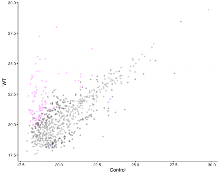
df <- load_maxquant(file = filename, datadir = filedir)df <- process_maxquant(df, group1 = "WT", group2 = "Control")# same output as the automated workflowvolcano_plot_maxquant(df)# mean-mean plot with no labellingmean_plot_maxquant(df)# PCA plots to show the structure of the datapca_plot_maxquant(df)pca_plot_maxquant(df, by_protein = TRUE)


Why write an R package for volcano plots?
The best tool for analysing MaxQuant data is the Windows program Perseus. As wonderful as Perseus is, its graphics are terrible. This prompted me to write VolcanoPlot for IGOR years ago. The other motivation was that I wanted to make sure the analysis was correct (I felt back then that Perseus was too “black box” but I no longer hold that view). R is the main language we use in the lab these days and because IGOR is closed source and is no longer developed for mac, I am ported VolcanoPlot to R.
I wrote a while back about how I could recreate the look of VolcanoPlot in R, and the logical next step was to make a package, so that we no longer relied on VolcanoPlot. Potentially VolcanoPlotR could be expanded into a full-blown Perseus substitute, especially since PerseusR has been abandoned.
It’s true that there are several R packages out there, so why write anothere. There’s {EnhancedVolcano} and proteomics data analysis available in Bioconductor, as well as Joachim Goedhart’s shiny app. None of these suit our needs, for example VolcanoPlotR will combine multiple MaxQuant datasets, and I was also keen to keep the look of our graphics the same for consistency between papers.
—
The post title comes from “Eruption” by Van Halen from the Van Halen album. It’s an Eddie Van Halen instrumental which has broken the spirit of many a young guitar-slinger who’s tried to play it.
R-bloggers.com offers daily e-mail updates about R news and tutorials about learning R and many other topics. Click here if you're looking to post or find an R/data-science job.
Want to share your content on R-bloggers? click here if you have a blog, or here if you don't.