The Reorderable Data Matrix and the Promise of Pattern Discovery
R-bloggers 2013-06-12
Summary:
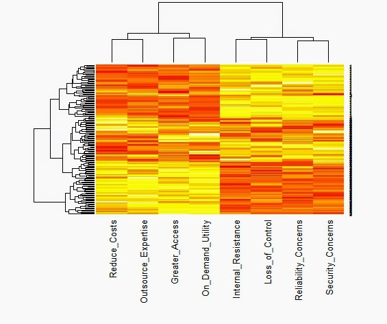
We typically start with the data matrix, a rectangular array of rows and columns. If we type its name on the R command line, it will show itself. But the data matrix is hard to read, even when there are not many rows or columns. The heat map is a visual alternative. All you need is the R function heatmap( ) from stats, and the data matrix structure will be displayed in black and white, shades of gray, or bright color schemes. However, you will need to know what you are looking for and how to display it. As Wilkinson and Friendly note in their American Statistician paper on The History of the Cluster Heat Map, "a heat map is a visual reflection of a statistical model." Consequently, the unordered data matrix and its accompanying heat map provide little assistance when searching for structure. Nor will any reordering do, only one that reflects the data generation process. The underlying pattern in the data is discoverable only when we have rearranged the rows and columns in a manner consistent with the processes that produced our data in first place. Jacques Bertin is a bit more poetic, "A graphic is not 'drawn' once and for all; it is 'constructed' and reconstructed until it reveals all the relationships constituted by the interplay of the data." To get more specific, let us look at a heat map from a simulated data matrix with 150 respondents rating on a nine-point scale how much they agreed with each of eight attitude statements measuring their willingness to adopt cloud computing technology.  This is cluster heat map with yellow indicating higher agreement and red showing the lower end of the same scale. Both the rows and the columns have been ordered by separate hierarchical cluster analyses. It appears that the columns are divided between the four positive attitudes toward cloud computing on the left and the four negative statements on the right. The rows are also ordered. The first 50 respondents give cloud computing a "thumbs-down" by endorsing the negative statements and rejecting the positive ones. The reverse is true for the last 50 respondents. Those in middle are redder than the other respondents, suggesting that they might be more ambivalent or simply less informed. It seems that the heat map can reveal the presence of well-separated clusters when we reorder the rows and columns to reflect that clustering. Here is the same heat map with random sorting of the rows and columns.
 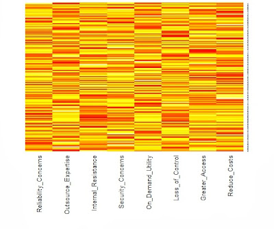 The difference between these two heat maps is not that one is ordered and the other is not. There are forces at work in the data matrix creating differences across both the respondents (rows) and the variables (columns). The row dendrogram works because we have three clusters or segments of respondents, each with a unique pattern of attitude ratings. Similarly, the factor structure underlying the eight ratings is mirrored in the column dendrogram. Little would have been revealed had the sorting not been based on a statistical model that captured these forces. Perhaps it would help if we looked at another example with a different underlying structure. Below, Wilkinson and Friendly show a binary data matrix display with several different settlements as the rows. They have noted when each settlement offered each of the functions listed in the columns by darkening the cell.
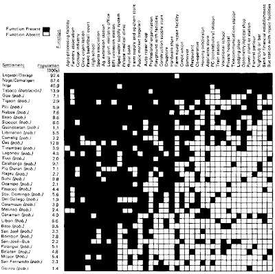

Because the rows and columns have been sorted or reordered, we can clearly see the underlying pattern. The settlements with the most functions were reordered to be located near the top of the table. Similarly, the functions were sorted so that the least frequent ones were positioned toward the right hand side o