Plotting individual observations and group means with ggplot2
R-bloggers 2016-10-26
Summary:
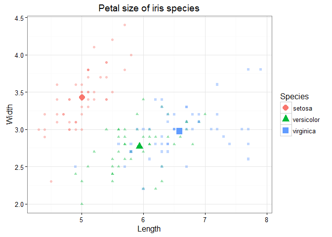
@drsimonj here to share my approach for visualizing individual observations with group means in the same plot. Here are some examples of what we’ll be creating:
I find these sorts of plots to be incredibly useful for visualizing and gaining insight into our data. We often visualize group means only, sometimes with the likes of standard errors bars. Alternatively, we plot only the individual observations using histograms or scatter plots. Separately, these two methods have unique problems. For example, we can’t easily see sample sizes or variability with group means, and we can’t easily see underlying patterns or trends in individual observations. But when individual observations and group means are combined into a single plot, we can produce some powerful visualizations.
General approach
Below is generic pseudo-code capturing the approach that we’ll cover in this post. Following this will be some worked examples of diving deeper into each component.
# Packages we needlibrary(ggplot2)library(dplyr)# Have an individual-observation data setid# Create a group-means data setgd <- id %>% group_by(GROUPING-VARIABLES) %>% summarise( VAR1 = mean(VAR1), VAR2 = mean(VAR2), ... )# Plot both data setsggplot(id, aes(GEOM-AESTHETICS)) + geom_*() + geom_*(data = gd)# Adjust plot to effectively differentiate data layers Tidyverse packages
Throughout, we’ll be using packages from the tidyverse: ggplot2 for plotting, and dplyr for working on the data. Let’s load these into our session:
library(ggplot2)library(dplyr)Group means on a single variable
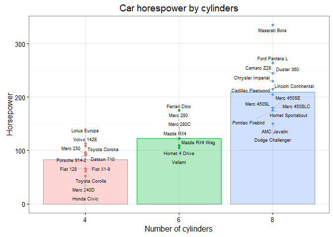
To get started, we’ll examine the logic behind the pseudo code with a simple example of presenting group means on a single variable. Let’s use mtcars as our individual-observation data set, id:
id <- mtcars %>% tibble::rownames_to_column() %>% as_data_frame()id#> # A tibble: 32 × 12#> rowname mpg cyl disp hp drat wt qsec vs am#> <chr> <dbl> <dbl> <dbl> <dbl> <dbl> <dbl> <dbl> <dbl> <dbl>#> 1 Mazda RX4 21.0 6 160.0 110 3.90 2.620 16.46 0 1#> 2 Mazda RX4 Wag 21.0 6 160.0 110 3.90 2.875 17.02 0 1#> 3 Datsun 710 22.8 4 108.0 93 3.85 2.320 18.61 1 1#> 4 Hornet 4 Drive 21.4 6 258.0 110 3.08 3.215 19.44 1 0#> 5 Hornet Sportabout 18.7 8 360.0 175 3.15 3.440 17.02 0 0#> 6 Valiant 18.1 6 225.0 105 2.76 3.460 20.22 1 0#> 7 Duster 360 14.3 8 360.0 245 3.21 3.570 15.84 0 0#> 8 Merc 240D 24.4 4 146.7 62 3.69 3.190 20.00 1 0#> 9 Merc 230 22.8 4 140.8 95 3.92 3.150 22.90 1 0#> 10 Merc 280 19.2 6 167.6 123 3.92 3.440 18.30 1 0#> # ... with 22 more rows, and 2 more variables: gear <dbl>, carb <dbl>Say we want to plot cars’ horsepower (hp), separately for automatic and manual cars (am). Let’s quickly convert am to a factor variable with proper labels:
id <- id %>% mutate(am = factor(am, levels = c(0, 1), labels = c("automatic", "manual")))Using the individual observations, we can plot the data as points via:
ggplot(id, aes(x = am, y = hp)) + geom_point()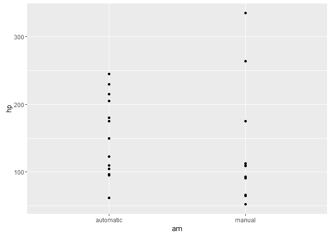
What if we want to visualize the means for these groups of points? We start by computing the mean horsepower for each transmission type into a new group-means data set (gd) as follows:
gd <- id %>% group_by(am) %>% summarise(hp = mean(hp))gd#> # A tibble: 2 × 2#> am hp#> <fctr> <dbl>#> 1 automatic 160.2632#> 2 manual 126.8462There are a few important aspects to this:
- We group our individual observations by the categorical variable using
group_by(). - We
summarise()the variable as itsmean(). - We give the summarized variable the same name in the new data set. E.g.,
hp = mean(hp)results inhpbeing in both data sets.
We c