Compared to what?
Stats Chat 2025-06-18
Via Bluesky from Instagram, and attributed to Chris Hipkins
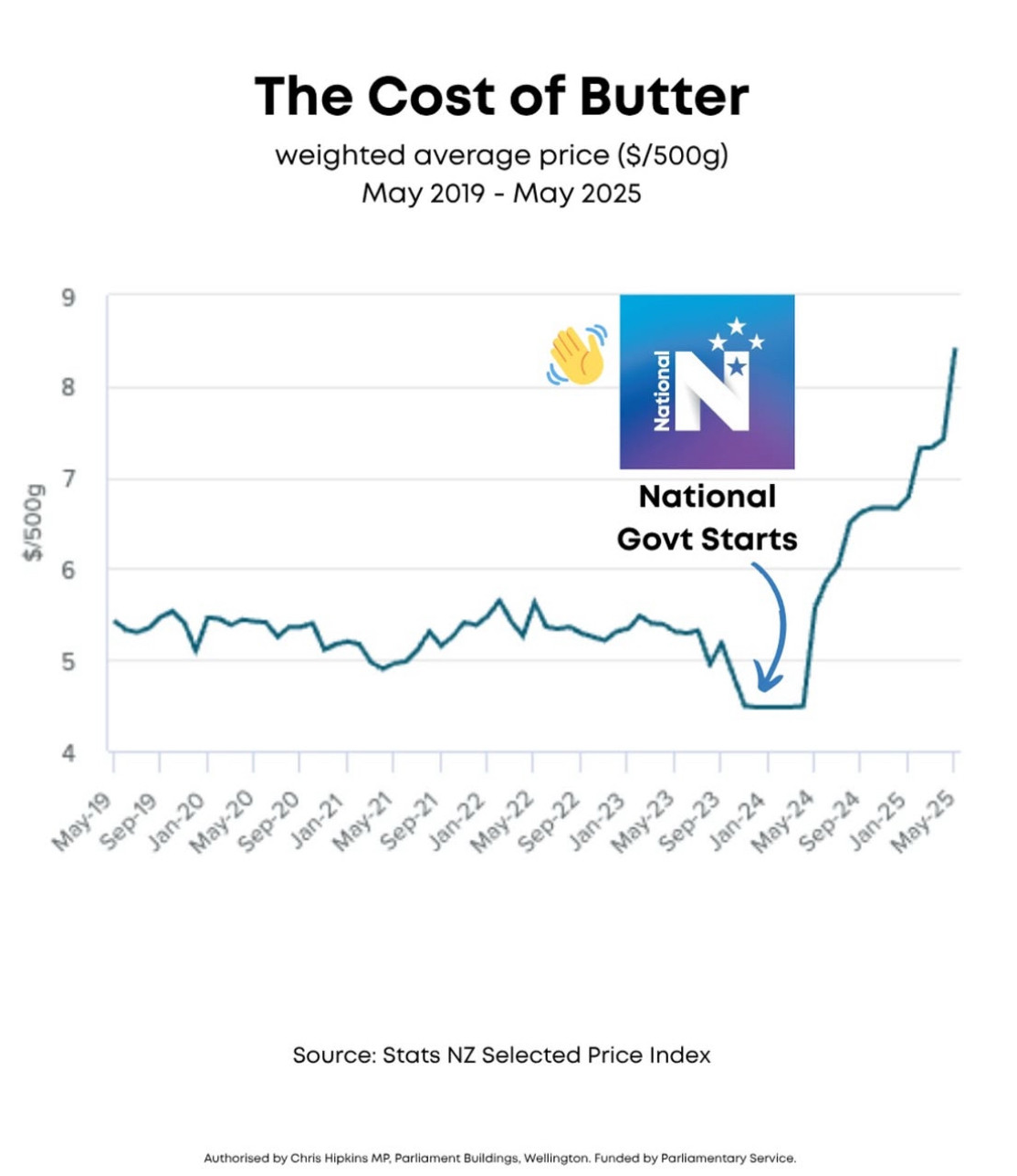
When StatsNZ produces the data here, it was purely descriptive: number go sideways, number go down, number go up. The use on @nzlabour’s Instagram and with a Chris Hipkins electoral authorisation obviously intends a comparison, even without the annotations. A simple comparison to the past — butter is more expensive now — is true, but it’s not what’s implied. We can tell it isn’t, because it would have no political implications and so wouldn’t be worth marketing.
The implied comparison here is to a scenario where the price of butter stays const (or keeps decreasing?) in 2024. The comparison is clearly bogus (which is why the graph is such an effective way to present it). You might approve or disapprove of NZ butter prices following global trends, and of the NZ supermarket duopoly having substantial pricing power, but these are ongoing issues and neither one is the fault of the current government. A Labour government that committed to not increasing taxes isn’t going to introduce price caps or government subsidies for butter!
The graph has the opposite problem to a lot of Covid comparisons. Here, the problem is comparing to a hypothetical world that is unrealistically different. For Covid, it’s comparing to a hypothetical world that’s unrealistically similar: talking as if we could have skipped lockdowns and just had a normal economy, when the real alternative is lots of illness and death and a much worse economic problem. The usefulness of counterfactual comparisons relies on making realistic choices about what would have been the same or different.
The post Compared to what? first appeared on Stats Chat.