Infographic of the week
Stats Chat 2014-10-22
From the twitter of the Financial Times, “Interactive: who is the better goalscorer, Messi or Ronaldo?”
I assume on the FT site this actually is interactive, but since they have the world’s most effective paywall, I can’t really tell.
The distortion makes the bar graph harder to read, but it doesn’t matter much since the data are all there as numbers: the graph doesn’t play any important role in conveying the information. What’s strange is that the bent graph doesn’t really resemble any feature of a football pitch, which I would have thought would be the point of distorting it.
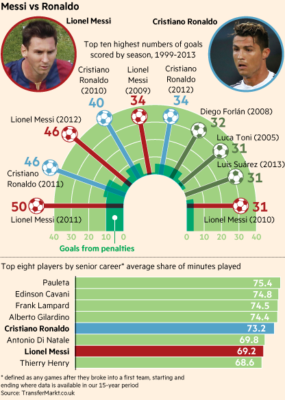
The question of who has the highest-scoring season is fairly easy to read off, but the question of “who is the better goalscorer” is a bit more difficult. Based on the data here, you’d have to say it was too close to call, but presumably there’s other information that goes into putting Messi at the top of the ‘transfer value’ list at the site where the FT got the data.
(via @economissive)