Things to check about your bar chart
Stats Chat 2017-02-09
There was some discussion yesterday on Twitter about age-representativeness of Parliament.
I tweeted this graph, from a 2014 General Election summary report, after checking that the source was reputable and that the bars started at zero.
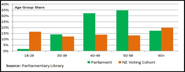
I didn’t check whether the age group shares added up to 100%. They don’t for the orange bars: it’s about 80%. That’s obviously wrong — there isn’t anywhere else for the missing 20% of people to be.
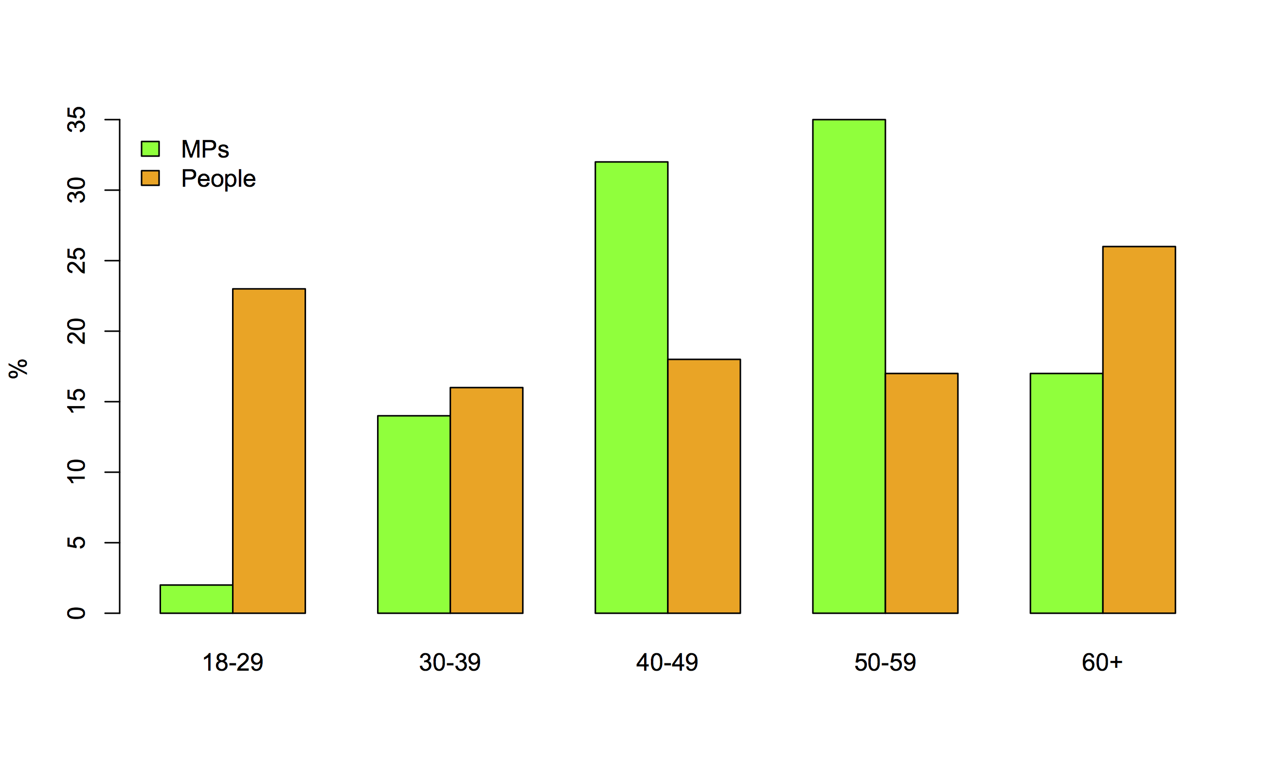
So, I found NZ population age structure data and tweeted this revision.
However, that’s the whole population and part of the point of the original graph might have been lower turnout at some ages. Here’s the graph with share of voters as well as of the population 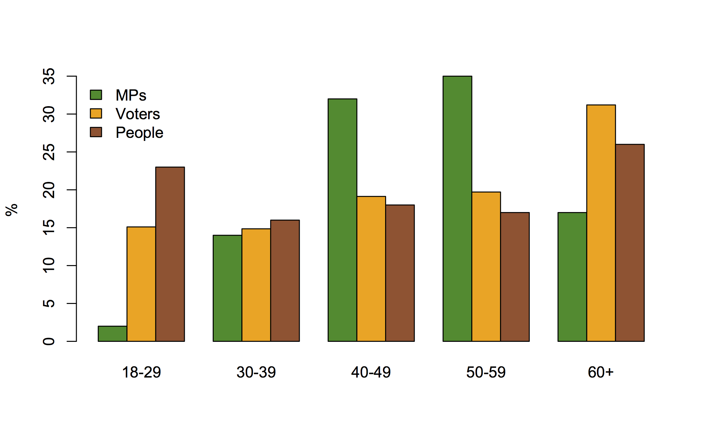
It’s not necessarily a good thing for the age distribution of voters to match that of voters or of adults in general, but if that’s what you wanted we have about the right number of thirtysomething MPs, but we have an excess in the 40-60 range and we’re missing under-30s and older people.
Compared to the population as a whole, Parliament’s also a bit low on women, immigrants, and people who think medical marijuana use should be legal.