Showing MPs expenses
Stats Chat 2022-09-02
MPs expenses paid by the Parliamentary Service were published recently for the quarter ending June 30. Here are the averages by party (click to embiggen)
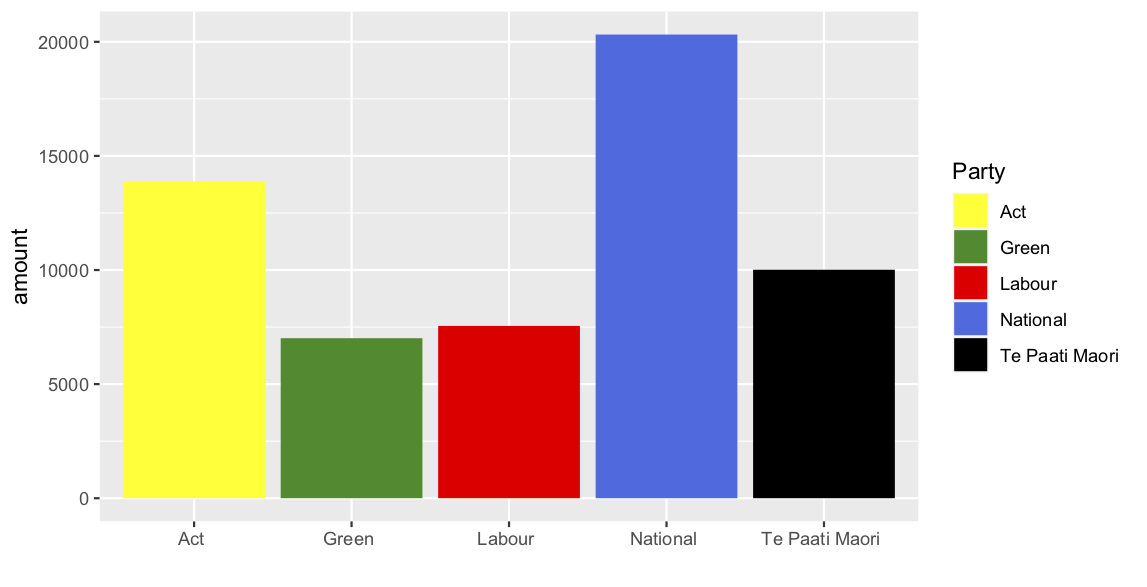
This is a terrible presentation of the data, though not the worst one I saw. Simple bar charts like this are sometimes useful, but can be very misleading. Here’s a dotplot, showing the individual data points
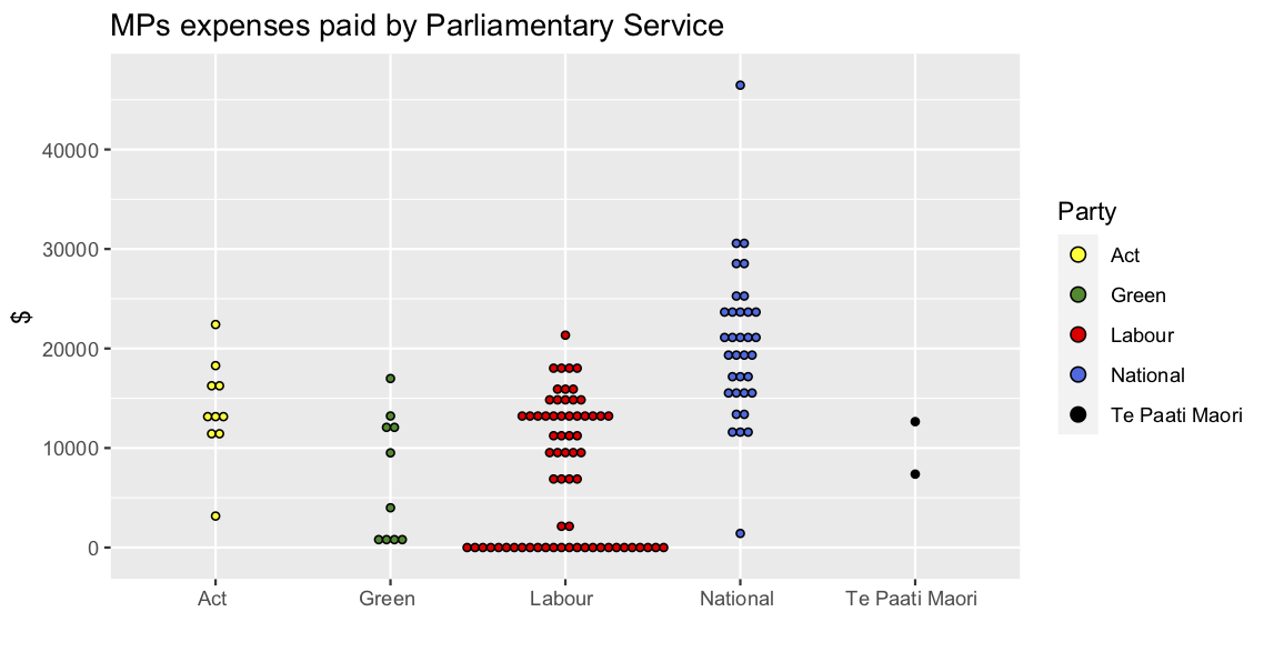
In this version, you should immediately notice something. There are a lot of Labour MPs who aren’t getting any expenses! This might then prompt you to go back to the website and read the “Understanding members’ expenses” page, and find out that these numbers don’t include Ministers’ expenses. Most of the ministers are in the Labour Party (for some reason) and that will pull down the average.
You might then remove the ministers and compare averages again, but it’s not obvious that’s a good comparison. The outlying blue dot at the top there is Chris Luxon. It seems reasonable that the leader of the opposition could have more expenses than a random MP. This then raises the question of whether comparing averages for non-Minister MPs between the government and opposition is sensible in general. There are other questions: for example, travel expenses will depend on where you live as well as where you go. While we’re looking at outliers, I should also note the outlying blue dot at the bottom. That’s Sam Uffindell. He was elected in a by-election on June 18, so he didn’t have much time to rack up expenses.
The post Showing MPs expenses first appeared on Stats Chat.