Olympic Records
Messy Matters 2013-03-15

This is a guest post by Jake Hofman, part of the original MESS in Messy Matters and now a researcher at Microsoft Research – New York City.We’re not sure where Jake’s own PRs would appear on the charts below but he crushed both Sharad and Dan this summer in the NYC Triathlon.
A recent New York Times feature compared the performance of Olympic medalists across time, highlighting, for example, how far back the 1896 gold medalist would have been if he were to have raced against Usain Bolt in this year’s 100 meter olympic event.Having seen the Times’ impressive visualization I wanted to play with the data myself, and so I scraped Olympic records for each sport over the past century from Sports Reference, a terrific site run by just a handful of folks who collect all kinds of fun information. [1]
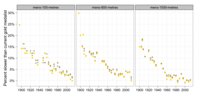
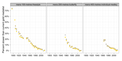
While the Times looked at the absolute distance gap between current and past competitors within events, I was curious about the relative performance of medalists across different sports and events.For example, how much progress has been made in track events over Olympic history, and how does this compare to progress in other sports?The figure below addresses these questions through the percent difference in times for past medalists — indicated by gold, bronze, and silver points — relative to their 2012 gold medal counterparts, with a sample of track events in the top row and swimming events in the bottom row.Across sports, distances, and event types, we see a remarkably similar pattern of rapid inital progress followed by a short period of stagnation during World War II, after which successively smaller improvements in times bring us to present day.
This pattern of relative progress holds for other Olympic events as well, although the rate of improvement varies by sport, as shown by the difference in scales for the track and swimming events — the relative improvement in men’s swimming is about twice the observed rate for track events.For instance, comparing Olympic competitors in 1960 to today’s athletes, we see that sprinters were about 7% slower while swimmers were more than 15% slower.As Nate Silver has pointed out, this difference is likely due to a number of factors, including changes in swimming regulations and technology (e.g., pool designs, skin suits, etc.) as well as varying costs of participation for running compared to swimming.Note that the butterfly and individual medley events show similar patterns of progress to freestyle swimming events despite being established over 50 years later, further supporting this argument.
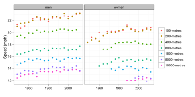
Taking a slightly different perspective on progress, the figure below shows medalist speeds for men’s and women’s track events over the last 50 years, from which we see that today’s sprinters are about 1 to 2 miles per hour faster than competitors in 1948. [2]Note that current day male sprinters in the 100 meter and 200 meter races run at nearly equal speeds of over 23 miles per hour, and longer distances are run at successively slower speeds.Somewhat surprisingly, 10K long distance runners maintain close to equal speeds to 5K competitors, despite running twice the distance.Also of note are FloJo’s long-standing 1988 world records in the 100 and 200 meters women’s races.
The other clear feature from these plots is the relative speed between male and female sprinters for the same event.As mentioned in a recent piece by The Atlantic, while one might imagine that this gender gap would decrease as we hit potential limits of human performance, men appear to consistently perform about 10 to 15 percent faster than women, as shown in the figure below. (A similar trend is found in swimming and other olympic sports.)
While the gap between top men and women is significant, don’t make the mistake of thinking it holds for all individuals.Indeed, to contrast Dan’s somewhat misleading introduction, I’ll note that Bethany destroyed each and every male member of Team Beeminder in the swim portion of the triathlon!
Footnotes
[1] Code to scrape the data and generate the plots is available on GitHub.
[2] While it’s initially tempting to place best-fit lines over these points, one quickly runs into the controversy around human speed limits, although this paper looks like an interesting approach.
Illustration by Kelly Savage


