19 Sketches of Quarterback Timelines
chartsnthings 2013-12-20
Summary:
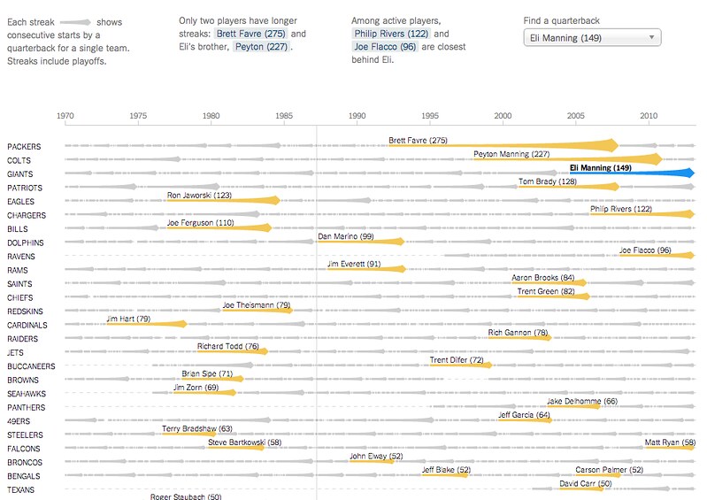
On Sunday Eli Manning started his 150th consecutive game for the Giants, the highest active streak in the NFL and the third-longest streak in NFL history. (One of the other two people above him is his brother, Peyton.)
The graphics department published an interactive graphic that put Eli’s streak in the context of about 2,000 streaks from about 500 pro quarterbacks. The graphic lets you explore the qbs and search for any quarterback or explore a team to go down memory lane for your team.
It’s not particularly important news, but the data provided by pro-football-reference is incredibly detailed and the concept lended itself to a variety of sketches. It was also good practice sketching in D3, which, once you memorize a few things, isn’t as painful as I had thought. (Being in SF for the fall makes learning easier, too, since I can interrupt Mike more easily when he’s sitting one desk over. )
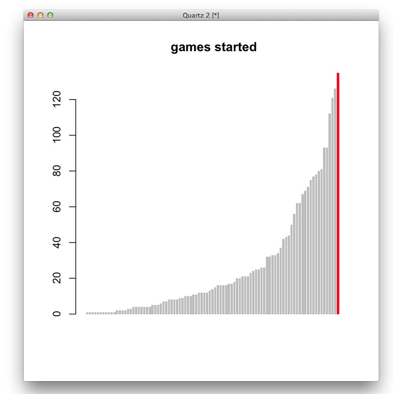
A couple bar charts in R. First, total games started (this compares Eli to QBs in his draft class or later).
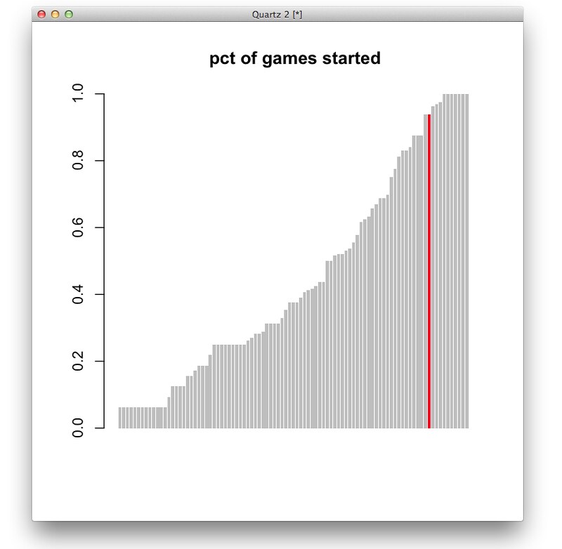
And percent of games started (the people are 100% are players like Andrew Luck or RGIII who just haven’t played a lot of seasons.)
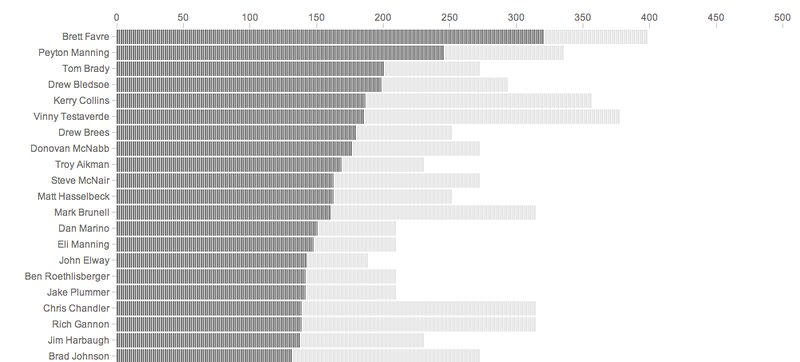
Ported to a browser, just using total starts:

And share of total possible starts
A different angle, showing teams with all the QBs who have started for them since 2004. (Sorry, Cleveland Browns.)

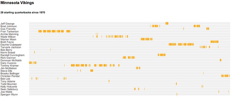
A similar idea, but mapping when each quarterback played for a particular team
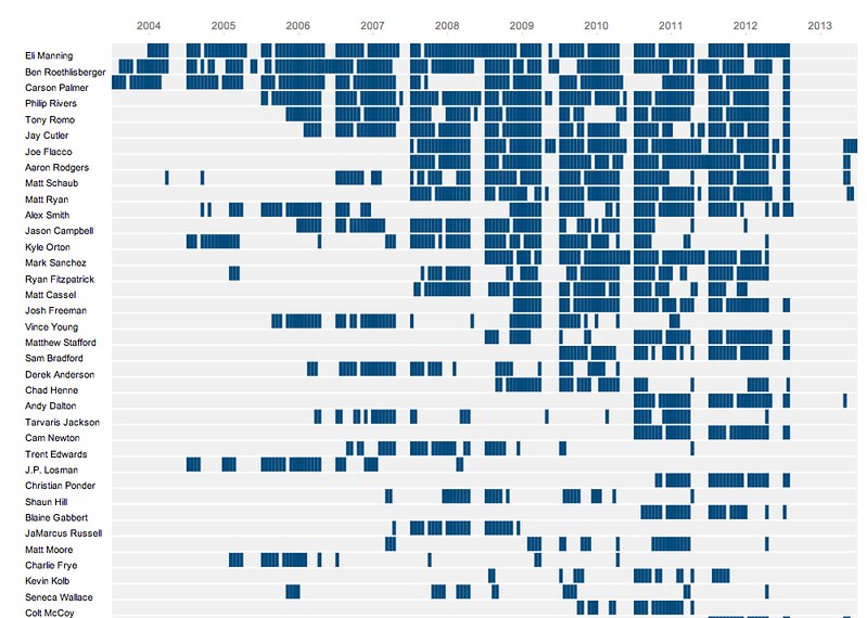
Or just showing all the quarterbacks, regardless of team, going back to 2004…
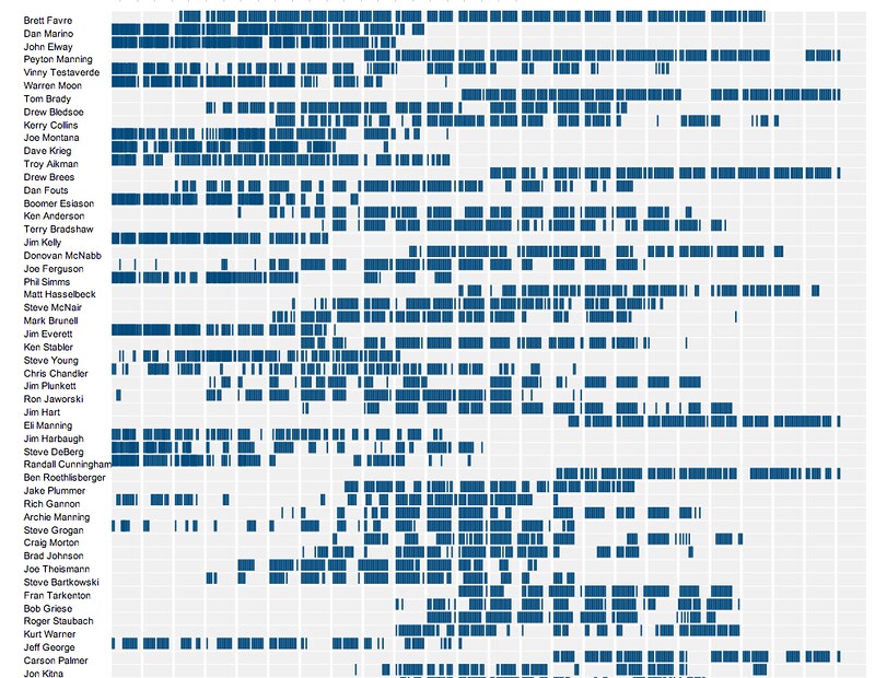
…or all the way back to 1970
Focuing on the teams took up less space, with a new color for each new QB. (Please wear sunglasses.)

Simplifying the output, only labeling prominent quarterbacks:
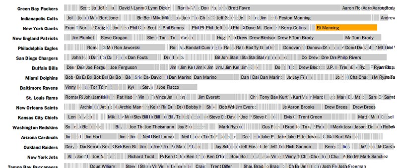
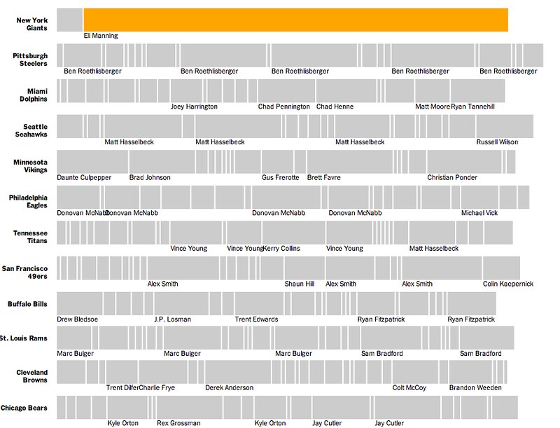
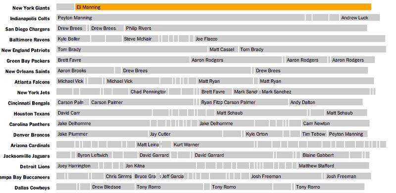
At this point this was the general thought, but there were still some thougts on what the bars could look like. Lines were one option:
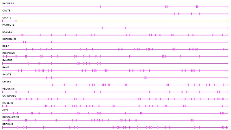
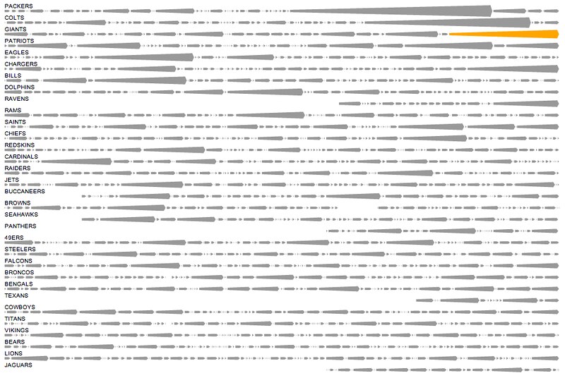
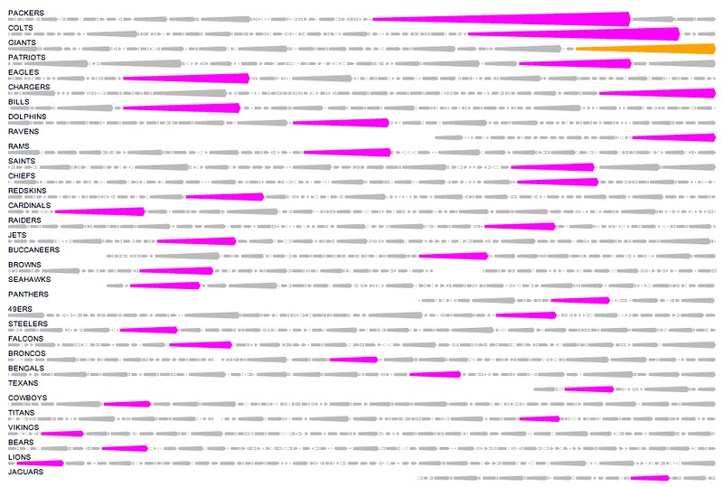
And then some more streak-like streaks, which eventually became more like arrows and less like, I don’t know, whatever you think these look like:
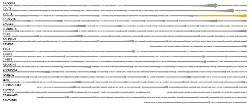

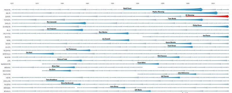
And the eventual one published Sunday, with search and fullscreen mode:
