Careful before you leap!
Bill Mitchell - billy blog » Eurozone 2013-12-20
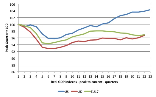
The triumphalism of British Chancellor George Osborne in recent weeks, as a modicum of positive economic news seeps out of the – Old Dart – or should I say Britain (given the Old Dart strictly refers to England), is almost too much to bear. Moreover, stand ready for a phalanx of I-told-you-so-mainstream-economists coming out in force lecturing all and sundry about the benefits of fiscal austerity. These characters have been hanging tough for any sign of growth (they have been waiting some years) so they could all chime in that austerity has created the conditions for the growth. They choose to misunderstand any evidence that might cast doubt on that (spurious) correlation. The reality is very different. Austerity has undermined growth and retarded the economies where it has been imposed. All economies eventually resume growth. But the legacy of the policy failure will remain for years to come. All I can say to these triumphal ones is – Careful before you leap! Here is the reality check. The following graph shows the evolution of real GDP in index number form, where the base period is the peak prior to the downturn. So for the US the peak was the December-2000 quarter, and for the UK and the Eurozone the peak quarter was March 2008.
The US economy is around 4.5 per cent larger than it was in December 2007.
You can see that the US economy passed the previous peak level of real GDP in the June-quarter 2011 (after 15 quarters) whereas the Eurozone and the UK remain at around 3 to 3.5 per cent below the previous peak after 22 quarters.
In other words, after 5.5 years since the last peak, the UK and EU17 economies have not yet wiped out the ground lost. You can also see that after showing signs of recovery (under the support of the fiscal expansion), both economies went down hill again under the weight of discretionary fiscal austerity.
That is clear from the following series of graphs.
The data for the EU17 comes from the – ECB Statistical Data Warehouse – although in one graph I show the IMF measure of the structural deficit (as a per cent of potential output), which comes from the – World Economic Outlook database (as at April 2013).
The data from the US comes from the Bureau of Economic Analysis (real GDP), the Bureau of Labor Statistics (Unemployment rates) and the Congressional Budget Office (Budget data).
The data for Britain comes from the Office of National Statistics.
Britain
The first graph shows the evolution of the public sector net borrowing (read) in £ billions in the UK (left-hand axis) and the real GDP growth rate (annualised) on the right-hand axis from the March-quarter 1999 to the June-quarter 2013.
Public sector net borrowing is equivalent to the net spending position (or deficit). You can see that after an attempt to run budget surplus led to a slowdown in real GDP growth in the early part of the current century, the stable deficit that followed maintained positive real GDP growth.
Then all hell broke out and the deficit increased dramatically because the loss of tax revenue pushed the automatic stabilisers into action and the national Labour government introduced discretionary fiscal stimulus.
The lagged response in real GDP growth was evidence as the deficit was growing.
But then in early-to-mid 2010, upon the election of the new national government – and all the fiscal austerity talk – real GDP growth started to collapse again.
From that point, the British government was running a pro-cyclical fiscal stance – that is, trying to cut net spending at a time the economy was slowing again – to the point that it drove the British economy back into recession.
It is also the case that the deficit has not been eliminated, which means that it is still providing some support to growth.
Note also that the current growth coincides with a rising net borrowing (that is, austerity is being relaxed). That reversal has clearly provided for higher private sector savings and provided some stimulus to growth.
So, be careful before you leap!
The next graph replaces the real GDP growth rate with the unemployment rate (right-axis). Up to the point of the crisis, the two series move together and the divergence as the crisis unfolded is entirely predictable and normal given the rising unemployment rate was due to a collapse in aggregate demand, which in turn undermined the tax revenue for the UK government (and so the deficit rose quite apart from the discretionary stimulus that was introduced.
Then you can see the austerity reversal and the pro-cyclical fiscal stance led to the unemployment rate rising steadily until the more recent period where some modest reductions have been had as a result of the austerity reversal.
Eurozone
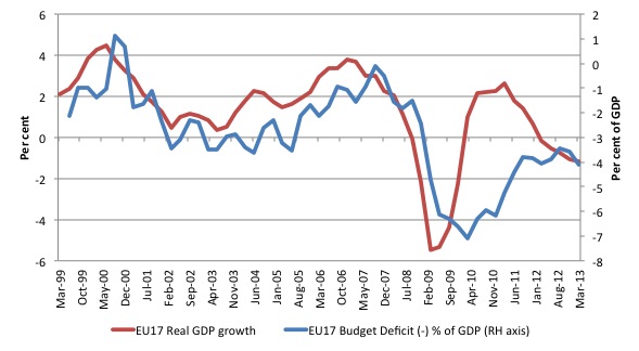
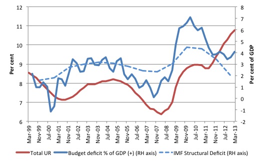
The two graphs that follow repeat the same sort of analysis for the Eurozone (except the fiscal position is the actual deficit/surplus as a per cent of GDP).
Once again, the sudden and deliberate reversal of the expansionary fiscal stance in the March-quarter 2010 as the Troika was set loose resulted in a massive collapse in real GDP growth.
The slight lag in response in real GDP growth occurred because it took a while for the austerity drive to sink into production (and private spending) behaviour.
As the austerity is tapering in the recent quarters, it is expected that real GDP growth will resume, albeit modestly, unless the deficits are ramped up significantly.
In terms of the unemployment graph, the same pro-cyclical pattern is evident. The dotted line is the IMFs estimate of the structural deficit (which you can take with a grain of salt – it is almost certainly biased on the excessive side). But it behaves in the same way as the official deficit measure.
The US
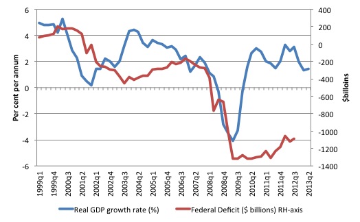
Finally, you can see the reason why the real GDP growth indexes in the opening graph are so different. The first graph shows that the fiscal stimulus in the US was maintained for much longer allowing the private savings to recover more strongly. The US government has largely avoided a pro-cyclical fiscal stance which sets it apart from the UK and the Eurozone.
It is clear that the reduction in the deficit has been possible as a result of positive real GDP growth, which has delivered increased tax revenue.
The final graph shows the evolution of the unemployment rate and the budget position. Again there is no evidence of a pro-cyclical fiscal stance being imposed.
Conclusion
This is not to say that the conduct of fiscal policy in the US has been ideal. It is clear that the deficit has been politically constrained and should have been much larger – perhaps twice as large.
But this blog is about comparisons and it is clear that the governments in the UK and the Eurozone have adopted fiscal stances which are the anathema to sound practice – that is, they have eschewed all standard macroeconomic thinking and imposed pro-cyclical policy positions and the evidence is there for all to see.
As Robert Skidelsky noted last week in his article – Osborne may gloat about recovery, but his “hard slog” will leave Britain worse off:
Economies always recover from their low points, whatever the policies pursued, sooner or later. Things happen, in the country or in the world, to revive business’s “animal spirits”. The question is whether they happen sooner or later and how long the recoveries last. Here, policy does matter.
There is no evidence to support the crowing triumphalism that the conservatives will start dishing up over the next few months.
The policy-induced situation in the UK and the Eurozone remains abysmal. Both economies might be starting to pop their heads above the water but the damage that austerity has wreaked is too large to even contemplate right now.
That is enough for today!
(c) Copyright 2013 Bill Mitchell. All Rights Reserved.


