The History of Web Design, 1993–2012: Season 5 Launch
Cybercultural: Internet History 2026-01-13
 Web design books; by Phillip Chee on Flickr, February 2010.
Welcome to season 5 of Cybercultural, which will be a history of web design from 1993 till 2012. That's twenty years of web design, going from the grey HTML webpages of 1993 through to the colourful, mobile-centric (yet responsive) designs of 2012.
This history of web design will cover two eras of the internet: dot-com and Web 2.0. I decided not to move into the rest of the 2010s, partly because that's an era when smartphone apps began to dominate — and so the web struggled. But also, in my view the first two decades of the web represent the very best of online creativity and experimentation. Because during that time, personal websites and blogs flourished.
Season 5 Structure
Before I describe the main themes, here's how this history of web design will play out over the coming months. As noted, I'll be covering 20 years — and each year will get its own overview post. In addition, I'll be profiling at least 28 individual web designers. Each will get their own article.
The web designers I'll write about will be a 50/50 split of men and women. I've also tried to select a diverse list. Some of these web design pioneers you will probably know well already (for example, Jeffrey Zeldman and Molly Holzschlag); others you may not of heard of before. In both cases, my goal is to showcase the innovations they contributed to the practice of web design and to highlight their best individual work. For each designer, I'll focus on a particular year in their career — so as not to overwhelm both myself and readers!
 Molly Holzschlag, Future of Web Design Conference, NYC, 2009; photo by Chris Casciano.
As with previous seasons of Cybercultural, my ultimate aim is to turn this into a book. I've already created an outline, with the following four sections:
- Part 1: Early Web Design Pioneers (1993 – 1997)
- Part 2: Flash & Experimental Movement (1998 – 2002)
- Part 3: Standards & CSS Evangelists (2003 – 2007)
- Part 4: Responsive & Mobile Era (2008 – 2012)
The resulting book should come out in 2027. Incidentally, another of my projects this year is to turn season 4 — about the birth of digital culture in the 1990s and early-2000s — into an ebook, hopefully coming out later this year.
 Jeffrey Zeldman, An Event Apart conference, San Francisco, 2009; photo by Kris Krüg.
I expect some variance to emerge as I actually write the articles for season 5, but you can get a sense of the topics I'll hit from the outline. I'm also very open to feedback as I go along, so please feel free to email me (richard AT cybercultural.com) or tag me on Mastodon, Bluesky or LinkedIn at any time with suggestions, corrections, etc.
Now let's look at a few of the main themes of this season.
Personal vs. Platforms
From the initial years of the web until the early-2000s, web design was all about individuality, creativity, self-expression, openness, and control over your publishing tools. It was also increasingly about contributing to a distributed network — at first via web rings and constructs like GeoCities neighbourhoods, then with the emergence of a more decentralised blogosphere.
 Auriea Harvey, creator of an award-winning experimental website in the 90s called Entropy8, speaking at ArtefactFestival in 2006. Alongside is her collaborator (and partner) Michaël Samyn and they're discussing their interactive site, The Endless Forest. Photo by yhancik.
But after the first decade of the web, the story of web design becomes more complicated.
While the blogosphere continued to expand over the 2000s, attempts to create a fully distributed social network — using blog comments, trackback, and RSS syndication — began to fizzle out. Centralized social networks and social media services, like Facebook and Twitter, arose during this decade and made it much easier for people to express themselves on the web without needing to design or manage a website or blog. As mainstream people joined the social web during late 2000s and into the 2010s, typically it was via a corporate offering like Facebook, Twitter, or even the ill-fated Google+.
Of course, there was a design cost to the growing influence of social media. It meant less visual creativity on the web, because social media templates were restrictive — especially once Facebook usurped MySpace, which had at least allowed users to add custom HTML. On Facebook, the most creative thing you could do was add a feature image (as long as it conformed to set dimensions and didn't upset Facebook's moderators).
 A 2001 article on A List Apart (screenshot: April 2003); the 'view source' philosophy filtered into the mainstream thanks to MySpace, but Facebook didn't allow custom HTML.
In summary then, social media resulted in bland design, stifled imaginations, and — most importantly — less user agency due to corporate algorithms and feeds. Now, this didn't stop individual web designers from continuing to produce remarkable work, but it's fair to say that social media platforms began to take control of the internet during the latter part of Web 2.0.
Smartphone Power Shift
At about the same time social media gained traction, web design as a profession took another hit as smartphone apps became the preferred application type. Smartphone apps weren't built with web technologies and weren't distributed on the open web. Instead they used native OS technologies and were distributed on proprietary app stores owned by Apple and Google — both launched in 2008.
This transition to apps took a few years to play out, because at first it was thought HTML5 — also released in 2008 — would enable web designers to build cross-platform mobile websites. Facebook famously created an HTML5 app for iPhone and Android, located at m.facebook.com; it didn't ditch this strategy until 2012 (another reason that year is my stopping point in this history).
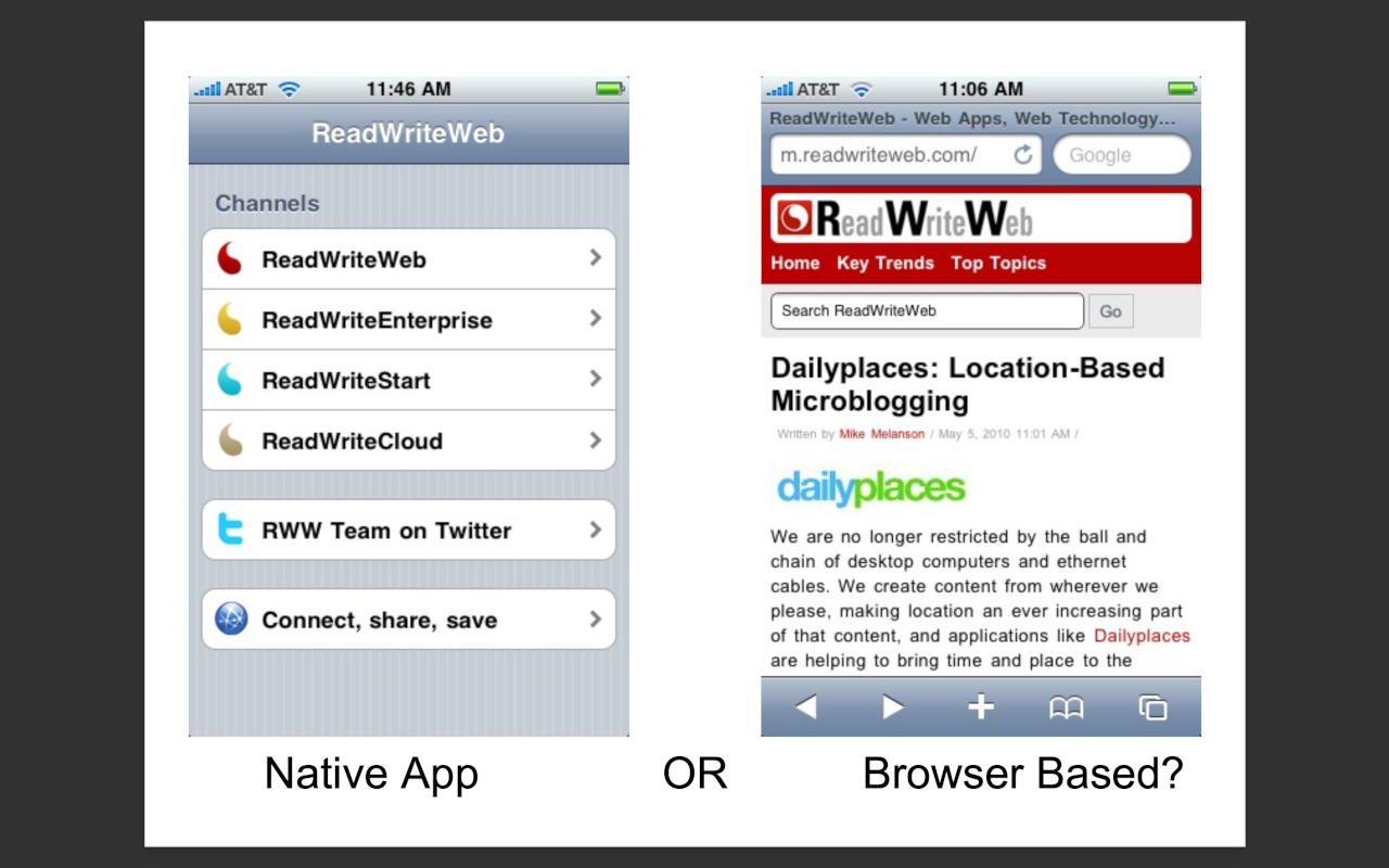 My tech blog, ReadWriteWeb, on mobile in 2010: native iOS app on the left, HTML on the right.
I don't want to dwell on the rise of centralized platforms over the latter part of my chosen time period (1993-2012), but it is an important influence in the history of web design. That's because big technology companies slowly began to control the design space during this time: not only via social media and smartphone app stores, but through browsers that didn’t fully support web standards (looking at you, Internet Explorer 6!). This trend even continued with Google Chrome and Google Reader — which were strong technical products and supported standards, but they gave Google ever more power on the open web, especially once Chrome had vanquished Microsoft's IE.
The Web Platform Fights Back
But don't worry, this history will also explore in-depth how the open web continued to evolve through the years — first to address increasing complexity in web development, then to counter the rise of smartphone apps.
A key design trend was "progressive enhancement," originally coined in 2003, which helped deal with web development complexity — especially due to JavaScript. Then in 2010, "responsive web design" became a rallying cry for web designers, allowing them to create websites that scaled down or up based on a user's display size. I'll be getting into the details of these and other web design approaches during this history.
 Ethan Marcotte, who coined 'responsive web design'; photo by David Rutledge in 2010.
Another key trend — especially towards the end of the period I'll be covering — is that the underlying web platform became more sophisticated. That was partly thanks to Google's stewardship, via the Chromium project; but also due to the rising influence of the Web Hypertext Application Technology Working Group (WHATWG), a group of browser vendors founded in 2004 that currently includes Google, Mozilla, Apple and Microsoft.
Last but not least, despite the rising dominance of proprietary social media platforms, the blogosphere didn't entirely die off. There was — and still is — a small, but significant, movement called the "indie web," members of which continue to build creative, expressive websites to this day.
 "Last week’s Homebrew Website Club SF was a bit chaotic. CSS guru Eric Meyer demonstrated float:right, while the rest of us attempted various z-index and transform properties." Photo and caption by Tantek Çelik, 2016.
Classic Web Inspiration
So what inspired me to write a history of web design?
Partly it comes from the top performing article on Cybercultural last year: The 3 Gurus of 90s Web Design: Zeldman, Siegel, Nielsen. That post really struck a chord with people, and made the front page of Hacker News last May. I also enjoyed writing it, because I have fond memories of that era of the web. I was just getting started in the industry at that time; I was creating my own websites in the mid-to-late 90s and trying to learn as much as I could from well-known designers like Zeldman, Siegel and Nielsen.
The feature image of that post was a photo of "my well-thumbed copies of three classic web design books: 'Creating Killer Web Sites' by David Siegel (1996-97), 'Taking your Talent to the Web' by Jeffrey Zeldman (2001), and 'Designing Web Usability' by Jakob Nielsen (1999)." Many of the designers I'll be profiling in season 5 have either written books or documented their learnings on their personal websites (sometimes both). So I'll be standing on the shoulders of giants in that respect.
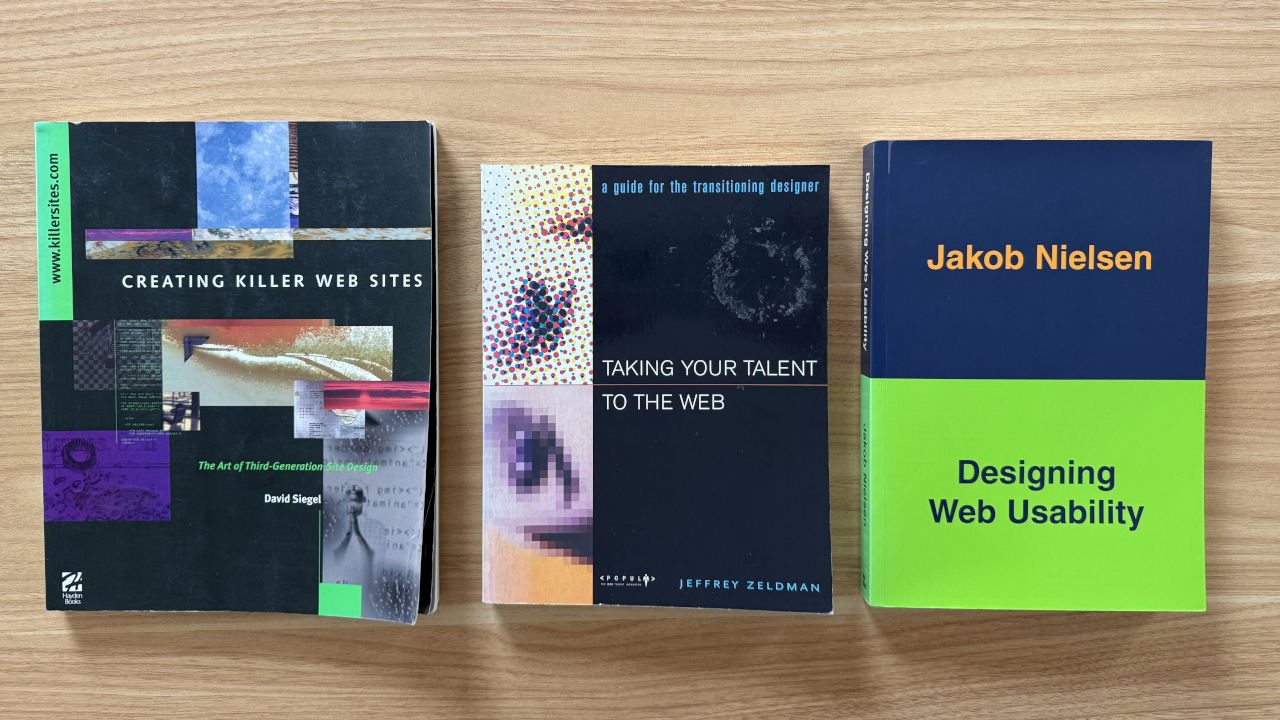 Three classic web design books on my bookshelf.
Finally, I'd like to invite you to also follow an alt Mastodon account I run called Classic Web, which is hosted on the appropriately named IndieWeb.Social instance. As it says on the tin, this account posts screenshots of classic websites and blogs from Dot-Com, Web 2.0 and the 2010s. You can also follow Classic Web on Bluesky (via a service called Bridgy Fed, which syndicates the Mastodon feed over to Bluesky).
I started the Classic Web account last March and it currently has around 2,400 followers on Mastodon and 800 on Bluesky. it's semi-automated, in that I have a Python script that gathers screenshots from the Wayback Machine on a regular cadence — via GitHub Actions — and posts them for me privately to Mastodon. I then manually curate the feed, so that only the best screenshots are posted publicly (e.g. I get a lot of broken images in the firehose feed, so I filter those out).
 The Classic Web Mastodon account.
People seem to enjoy the Classic Web feed, and I love curating it each day — the account has developed its own personality over the past 10 or so months. Throughout 2026, as I write season 5 of Cybercultural, I will try to complement each article with a set of matching screenshots on the Classic Web feed. So I encourage you to follow the Classic Web account on Mastodon or Bluesky if this interests you.
Stay Tuned
If you're not already subscribed to Cybercultural and would like to be notified of all articles in this history of web design, please sign up via email or add the RSS feed to your RSS Reader. The articles will come out weekly, with the occasional break, and typically on a Tuesday or Wednesday.
See you next week for the first post, beginning way back in 1993!